EditBox
StdUi has few editboxes that you can use:
StdUi:SimpleEditBox(parent, width, height, text)Description:
This is the simplest implementation of EditBox. It does not have any validators and its value is updated on the fly. It is worth to mention that OnEscapePressed is already hooked and clears focus so you don't need to hook it yourself.
Arguments:
-
parentFrame - object that should be a parent of EditBox -
widthnumber (Optional) - Width of the EditBox -
heightnumber (Optional) - Height of the EditBox -
textstring (Optional) - String that should be as initial value
Returns:
Example:
local editBox = StdUi:SimpleEditBox(window, 100, 20, 'Initial Text');StdUi:SearchEditBox(parent, width, height, placeholderText)Description:
Very similar to simple edit box with few key differences: It has placeholder text and placeholder icon. Placeholder automatically hides when you type something in the editbox. OnTextChanged is hooked because of that.
Arguments:
-
parentFrame - object that should be a parent of EditBox -
widthnumber (Optional) - Width of the EditBox -
heightnumber (Optional) - Height of the EditBox -
placeholderTextstring (Optional) - String that should be placeholder
Returns:
Named children:
-
editBox.placeholder.label- FontString - FontString that is used as placeholder text -
editBox.placeholder.icon- Texture - Texture that is used as placeholder icon
Example:
local editBox = StdUi:SearchEditBox(window, 100, 20, 'Search');StdUi:EditBox(parent, width, height, text, validator)Description:
A proper implementation of EditBox with validator. It does have OK button that shows whenever value has changed and is different from last value. Because of that OnTextChanged, OnEnterPressed hooks are used.
Arguments:
-
parentFrame - object that should be a parent of EditBox -
widthnumber (Optional) - Width of the EditBox -
heightnumber (Optional) - Height of the EditBox -
textstring (Optional) - String that should be as initial value -
validatorfunction (Optional) - Function that is fired each time value has been confirmed either by clicking OK button or pressing Enter. It has the ability to mark edit box value as Invalid. If you do not provide validator, default one will be used that accepts everything.
Returns:
Named children:
-
editBox.isValid- bool - variable that indicates if EditBox value is valid -
editBox.isValidated- bool - variable that indicates when EditBox is being currently validated -
editBox.button- Button - The 'OK' button itself
Methods
StdUi adds few additional methods:
-
IsValid()- bool - returns if current value is valid according to validator -
Validate()- Calls the validator and changes value is it is valid -
GetValue()- Gets the current (or last valid) value -
SetValue(value)- Sets the current value -
OnValueChanged()- callback that fires when value has been changed, override this if you wish to get notified whenever value has been changed.
Example:
local editBox = StdUi:EditBox(window, 100, 20, 'Some Text');StdUi:NumericBox(parent, width, height, text, validator)Description:
Very similar to the above EditBox but it only accepts numerical values.
Arguments:
-
parentFrame - object that should be a parent of EditBox -
widthnumber (Optional) - Width of the EditBox -
heightnumber (Optional) - Height of the EditBox -
textstring (Optional) - String that should be as initial value -
validatorfunction (Optional) - Function that is fired each time value has been confirmed either by clicking OK button or pressing Enter. It has the ability to mark edit box value as Invalid. If you do not provide validator, default one will be used that accepts everything in between minValue and maxValue.
Returns:
Named children:
Check above EditBox for named children, additionaly it has 2 more:
-
editBox.minValue- number - minimum value for EditBox -
editBox.maxValue- number - maximum value for EditBox
Methods
Check EditBox methods, additionally NumericBox has:
-
SetMinValue(value)- Sets minimum value for EditBox and validates input -
SetMaxValue(value)- Sets maximum value for EditBox and validates input
Example:
local editBox = StdUi:NumericBox(window, 100, 20, 50);StdUi:MoneyBox(parent, width, height, text, validator)Description:
Very similar to the above EditBox but it accepts money input such as:
5g55g 24s 40c55g24s40c55g 40c-
55g9990c- yes it does accept it and convert it to proper value
So as you can see it is very flexible. Note: It does return number of coppers, not the actual money string.
Arguments:
-
parentFrame - object that should be a parent of EditBox -
widthnumber (Optional) - Width of the EditBox -
heightnumber (Optional) - Height of the EditBox -
textstring (Optional) - String that should be as initial value -
validatorfunction (Optional) - Function that is fired each time value has been confirmed either by clicking OK button or pressing Enter. It has the ability to mark edit box value as Invalid. If you do not provide validator, default one will be used that accepts a properly formatted money inputs.
Returns:
Named children:
Check above EditBox for named children, additionaly it has 2 more:
-
editBox.minValue- number - minimum value for EditBox -
editBox.maxValue- number - maximum value for EditBox
Methods
Check EditBox methods. No additional methods are provided.
Example:
local editBox = StdUi:MoneyBox(window, 100, 20, '55g 6s 999c');StdUi:MultiLineBox(parent, width, height, text)Description:
Multi line box is a special kind of widget which is a combination of ScrollFrame + EditBox. As the name suggests, it supports multiple lines of text.
Note: Please keep in mind anchoring
editBoxvariable will never work. You should anchor thepanel.
Arguments:
-
parentFrame - object that should be a parent of EditBox -
widthnumber (Optional) - Width of the EditBox -
heightnumber (Optional) - Height of the EditBox -
textstring (Optional) - String that should be as initial value
Returns:
Named children:
-
editBox.scrollFrame- ScrollFrame - ScrollFrame that hasEditBoxin it -
editBox.panel- Frame - Frame that is a parent for wholeEditBoxandScrollFrame. Use it to make your anchors.
From a scrollFrame you can actually get to its ScrollBar if needed.
Example:
local panel, editBox = StdUi:MultiLineBox(window, 200, 106, 'test');Click to play video
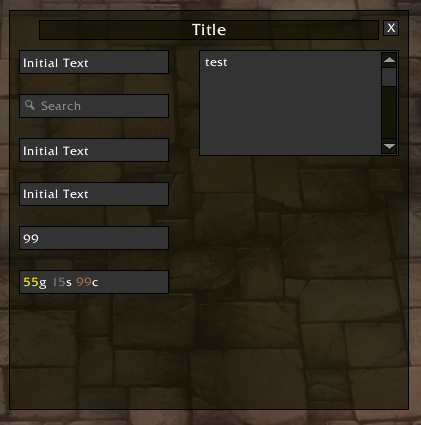
local StdUi = LibStub('StdUi');


local window = StdUi:Window(UIParent, 'Title', 400, 400);
window:SetPoint('CENTER');

local eb1 = StdUi:SimpleEditBox(window, 150, 24, 'Initial Text');
StdUi:GlueTop(eb1, window, 10, -40, 'LEFT');

local eb2 = StdUi:SearchEditBox(window, 150, 24, 'Search');
StdUi:GlueBelow(eb2, eb1, 0, -20, 'LEFT');

local eb3 = StdUi:EditBox(window, 150, 24, 'Initial Text');
StdUi:GlueBelow(eb3, eb2, 0, -20, 'LEFT');

local function customValidator(self)
	local text = self:GetText();
	if text == 'abc' then
		StdUi:MarkAsValid(self, false); -- red edge
		return false;
	else
		self.value = text;
		StdUi:MarkAsValid(self, true);
		return true;
	end

end

local eb4 = StdUi:EditBox(window, 150, 24, 'Initial Text', customValidator);
StdUi:GlueBelow(eb4, eb3, 0, -20, 'LEFT');

local eb5 = StdUi:NumericBox(window, 150, 24, 99);
eb5:SetMaxValue(100);
eb5:SetMinValue(20);
StdUi:GlueBelow(eb5, eb4, 0, -20, 'LEFT');

local eb6 = StdUi:MoneyBox(window, 150, 24, '55g 6s 999c');
eb6:Validate();
StdUi:GlueBelow(eb6, eb5, 0, -20, 'LEFT');


local mb = StdUi:MultiLineBox(window, 200, 106, 'test');
StdUi:GlueTop(mb.panel, window, -10, -40, 'RIGHT');