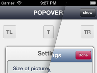
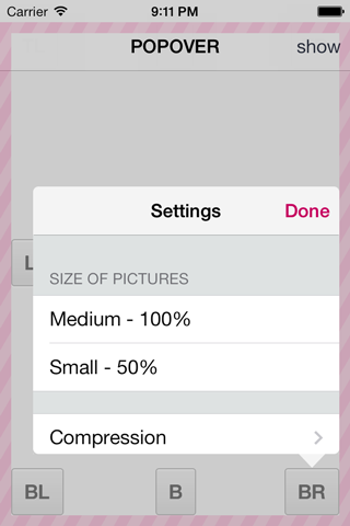
This fork is being actively maintained. The original one seems to have been abandoned.
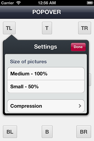
WYPopoverController is for the presentation of content in popover on iPhone / iPad devices. Very customizable.
- UIAppearance support
- Works like UIPopoverController
- Works also with blocks
- Animation options
- Automatic orientation support
- UIStoryboard support
- Keyboard show / hide support
- iOS 6 & 7 support
- UIAccessibility support
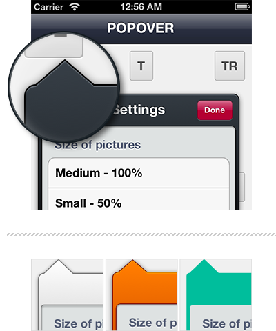
- Theme support
| Property | Type | Default value (iOS 6) | Default value (iOS 7) |
|---|---|---|---|
| usesRoundedArrow | BOOL |
NO | YES |
| tintColor | UIColor |
nil | nil |
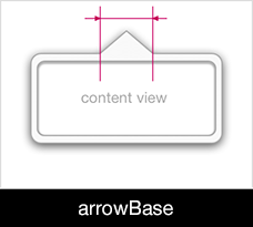
| arrowBase | NSUInteger |
42 | 25 |
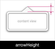
| arrowHeight | NSUInteger |
18 | 13 |
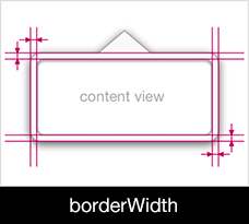
| borderWidth | NSUInteger |
6 | 0 |
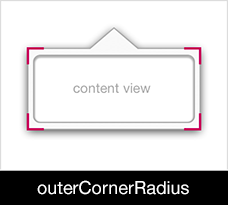
| outerCornerRadius | NSUInteger |
8 | 5 |
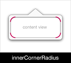
| innerCornerRadius | NSUInteger |
6 | 0 |
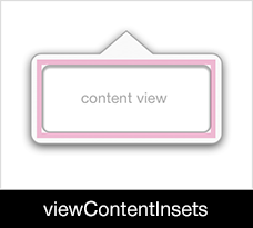
| viewContentInsets | UIEdgeInsets |
{ 3, 0, 0, 0 } | UIEdgeInsetsZero |
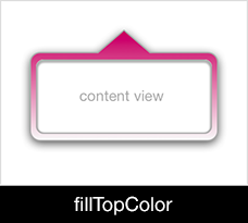
| fillTopColor | UIColor |
#373f47ff | #f4f4f4ff |
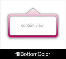
| fillBottomColor | UIColor |
#3b434cff | #f4f4f4ff |
| glossShadowColor | UIColor |
#c3c5c77f | #transparent |
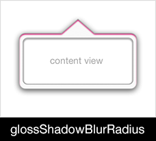
| glossShadowBlurRadius | NSUInteger |
0 | 0 |
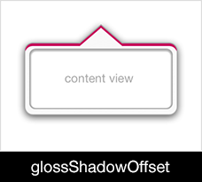
| glossShadowOffset | CGSize |
{ 0, 1.5 } | CGSizeZero |
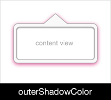
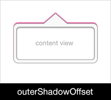
| outerShadowColor | UIColor |
#000000bf | #transparent |
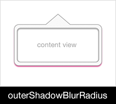
| outerShadowBlurRadius | NSUInteger |
8 | 0 |
| outerShadowOffset | CGSize |
{ 0, 2 } | CGSizeZero |
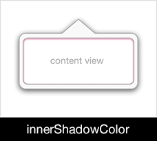
| innerShadowColor | UIColor |
#000000bf | #transparent |
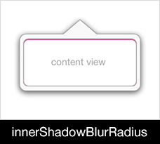
| innerShadowBlurRadius | NSUInteger |
2 | 0 |
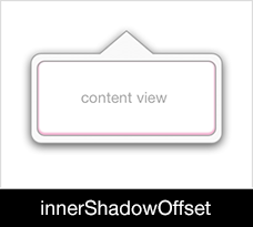
| innerShadowOffset | CGSize |
{ 0, 1 } | CGSizeZero |
| minOuterCornerRadius | NSUInteger |
0 | 0 |
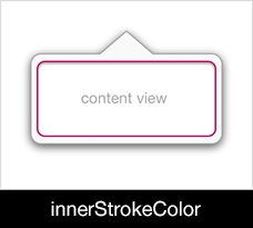
| innerStrokeColor | UIColor |
#262c31ff | #transparent |
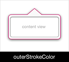
| outerStrokeColor | UIColor |
#262c31ff | #transparent |
| dimsBackgroundViewsTintColor | BOOL |
YES | YES |
usesRoundedArrow (enabled by default) produces a nicely curved arrow. Set it to NO to revert to the old pointy arrow.
dimsBackgroundViewsTintColor controls whether views behind the overlay have their tint color dimmed.
An array of views that the user can interact with while the popover is visible.
Determines whether the default content appearance should be used for the popover.
The margins that define the portion of the screen in which it is permissible to display the popover.
A block object can be executed when animation sequences ends. This parameter may be nil.
Important : If a block object is defined then correspondent delegate methods is not called.
popover = [[WYPopoverController alloc] initWithContentViewController:contentViewController];
[popover presentPopoverAsDialogAnimated:YES
                             completion:^{
                                 // Code executed after popover presentation animation sequence ends
}];There are 3 styles of animation :
- Fade (by default)
- Scale
- Fade with Scale
popover = [[WYPopoverController alloc] initWithContentViewController:contentViewController];
[popover presentPopoverFromRect:btn.bounds
                         inView:btn
       permittedArrowDirections:WYPopoverArrowDirectionAny
                       animated:YES
options:WYPopoverAnimationOptionFadeWithScale];WYPopoverController uses ARC.
iOS SDK 7.0 (with Xcode 5) is required.
Add this line pod 'WYPopoverController', '~> 0.3.9' to your PodFile.
Your PodFile should look like :
platform :ios, '6.0'
pod 'WYPopoverController', '~> 0.3.9'
To use the master branch of the repo :
platform :ios, '6.0'
pod 'WYPopoverController', :git => 'https://github.com/sammcewan/WYPopoverController.git'Add these files to your project :
WYPopoverController.handWYPopoverController.mWYStoryboardPopoverSegue.handWYStoryboardPopoverSegue.m
And link QuartzCore.framework library in the Build Phases of your project targets.
In the implementation of your view controller
// YourViewController.m

@interface YourViewController () <WYPopoverControllerDelegate>
{
    WYPopoverController* popoverController;
}

- (IBAction)showPopover:(id)sender;

@end

@implementation YourViewController

- (IBAction)showPopover:(id)sender
{
	popoverController = [[WYPopoverController alloc] initWithContentViewController:controller];
    popoverController.delegate = self;
    [popoverController presentPopoverFromRect:button.bounds inView:button permittedArrowDirections:WYPopoverArrowDirectionAny animated:YES];
}

- (BOOL)popoverControllerShouldDismissPopover:(WYPopoverController *)controller
{
    return YES;
}

- (void)popoverControllerDidDismissPopover:(WYPopoverController *)controller
{
    popoverController.delegate = nil;
    popoverController = nil;
}

@end[WYPopoverController setDefaultTheme:[WYPopoverTheme theme]];
WYPopoverBackgroundView *appearance = [WYPopoverBackgroundView appearance];
[appearance setTintColor:[UIColor orangeColor]];UIColor *greenColor = [UIColor colorWithRed:26.f/255.f green:188.f/255.f blue:156.f/255.f alpha:1];
[WYPopoverController setDefaultTheme:[WYPopoverTheme theme]];
WYPopoverBackgroundView *popoverAppearance = [WYPopoverBackgroundView appearance];
[popoverAppearance setOuterCornerRadius:4];
[popoverAppearance setOuterShadowBlurRadius:0];
[popoverAppearance setOuterShadowColor:[UIColor clearColor]];
[popoverAppearance setOuterShadowOffset:CGSizeMake(0, 0)];
[popoverAppearance setGlossShadowColor:[UIColor clearColor]];
[popoverAppearance setGlossShadowOffset:CGSizeMake(0, 0)];
[popoverAppearance setBorderWidth:8];
[popoverAppearance setArrowHeight:10];
[popoverAppearance setArrowBase:20];
[popoverAppearance setInnerCornerRadius:4];
[popoverAppearance setInnerShadowBlurRadius:0];
[popoverAppearance setInnerShadowColor:[UIColor clearColor]];
[popoverAppearance setInnerShadowOffset:CGSizeMake(0, 0)];
[popoverAppearance setFillTopColor:greenColor];
[popoverAppearance setFillBottomColor:greenColor];
[popoverAppearance setOuterStrokeColor:greenColor];
[popoverAppearance setInnerStrokeColor:greenColor];
UINavigationBar* navBarInPopoverAppearance = [UINavigationBar appearanceWhenContainedIn:[UINavigationController class], [WYPopoverController class], nil];
[navBarInPopoverAppearance setTitleTextAttributes: @{
UITextAttributeTextColor : [UIColor whiteColor],
UITextAttributeTextShadowColor : [UIColor clearColor],
UITextAttributeTextShadowOffset : [NSValue valueWithUIOffset:UIOffsetMake(0, -1)]}];- (void)prepareForSegue:(UIStoryboardSegue *)segue sender:(id)sender
{
if ([segue.identifier isEqualToString:@"[YOUR_SEGUE_IDENTIFIER]"])
{
WYStoryboardPopoverSegue* popoverSegue = (WYStoryboardPopoverSegue*)segue;
UIViewController* destinationViewController = (UIViewController *)segue.destinationViewController;
destinationViewController.contentSizeForViewInPopover = CGSizeMake(280, 280); // Deprecated in iOS7. Use 'preferredContentSize' instead.
popoverController = [popoverSegue popoverControllerWithSender:sender permittedArrowDirections:WYPopoverArrowDirectionAny animated:YES];
popoverController.delegate = self;
}
}Introduced in 0.2.1 release, you can change appearance of your popovers with themes.
- (void)changePopoverTheme
{
    popover.theme = [WYPopoverTheme themeForIOS6];  // you set a new theme

    // use beginThemeUpdates and endThemeUpdates methods if you have to change several values which compose your current theme

    [popover beginThemeUpdates];
        popover.theme.arrowHeight = 30;
        popover.theme.arrowBase = 40;
    [popover endThemeUpdates];
}By default, when keyboard is shown, popover will be repositionned if it is (partially) hidden.
Introduced in 0.2.1 release, you can control value of y offset when keyboard is shown with the following delegate method :
- (void)popoverController:(WYPopoverController *)popoverController willTranslatePopoverWithYOffset:(CGFloat *)value
{
    *value = 0; // if value is setted to 0 then popover will not be translated
}When showing a popover controller, there are times when you will need to handle how the popover controller appears after a change in device orientation.
Situations when handling is required:
- If the popover controller is presented from a target rectangle using the
-presentPopoverFromRect:inView:permittedArrowDirections:animatedmethod of WYPopoverController. You can use-popoverController:willRepositionPopoverToRect:inView:method introduced in the 0.1.6 release . - If the popover controller is presented from a bar button item that is removed after the rotation has finished .
A brief summary of each WYPopoverController release can be found on the wiki.
WYPopoverController is available under the MIT license.
Copyright © 2013 Nicolas CHENG
Permission is hereby granted, free of charge, to any person obtaining a copy of this software and associated documentation files (the "Software"), to deal in the Software without restriction, including without limitation the rights to use, copy, modify, merge, publish, distribute, sublicense, and/or sell copies of the Software, and to permit persons to whom the Software is furnished to do so, subject to the following conditions:
The above copyright notice and this permission notice shall be included in all copies or substantial portions of the Software.
THE SOFTWARE IS PROVIDED "AS IS", WITHOUT WARRANTY OF ANY KIND, EXPRESS OR IMPLIED, INCLUDING BUT NOT LIMITED TO THE WARRANTIES OF MERCHANTABILITY, FITNESS FOR A PARTICULAR PURPOSE AND NONINFRINGEMENT. IN NO EVENT SHALL THE AUTHORS OR COPYRIGHT HOLDERS BE LIABLE FOR ANY CLAIM, DAMAGES OR OTHER LIABILITY, WHETHER IN AN ACTION OF CONTRACT, TORT OR OTHERWISE, ARISING FROM, OUT OF OR IN CONNECTION WITH THE SOFTWARE OR THE USE OR OTHER DEALINGS IN THE SOFTWARE.
