Visit the website at: https://www.opensuse.org/
1 - Install all the dependencies:
npm install
2 - Gulp is our build system and task manager. It will take care of watching for changes to re-build the assets, as well as launching a local test server:
npx gulp
3 - Visit http://localhost:8000
If yes is your answer, then you will make thousands of users happy to have the openSUSE landing page in their language.
The openSUSE translations are provided by https://l10n.opensuse.org/. You can log in with your openSUSE account there.
For introducing a new language, you need to continue reading.
Now its time to add the new language to the dropdown. For this follow the next steps:
- Inside the 'index.html' search with your text editor for 'dropdownMenu1', which is the list containing the options of languages available.
- Add a new option to the list by simply adding a like such
<li><a href="#" class="change-language" data-language-value="es">Spanish</a></li>. Note that thedata-language-valueattribute contains the value of the international code of the language you added. - Now we have added the file in the dropdown, and the last step is to include the translation file. For this, you need to open the file assets/js/opensuse-theme.js . Here you need to search for "i18n" and add your language following the pattern there.
GULP is used to run automatic tasks to preprocess CSS (from less), compress images, and optimize and compress JS.
# zypper in 'rubygem(nokogiri)' 'rubygem(gettext)' npm gettext-tools
$ po/update_po.rb
$ npm update
$ npm install gulp
$ node_modules/.bin/gulp
More info about gulp here
Gulp will give the final touch in the code so then you only need to open the project in your browser http://localhost:8000 Test your language works well. To make sure there is no variable without translation, open up the web inspector of your browser and check if there is error message in the console, if not, you have done an Excellent job! So, open a new Pull Request in github, we will double check everything is fine, and then Merge your contribution!
These were removed from the page and will not be used due to concerns related to the fonts sending IP info back to Google's hosted server. Don't import any external CDN for API or fonts, JS-Frameworks to avoid legal problems.
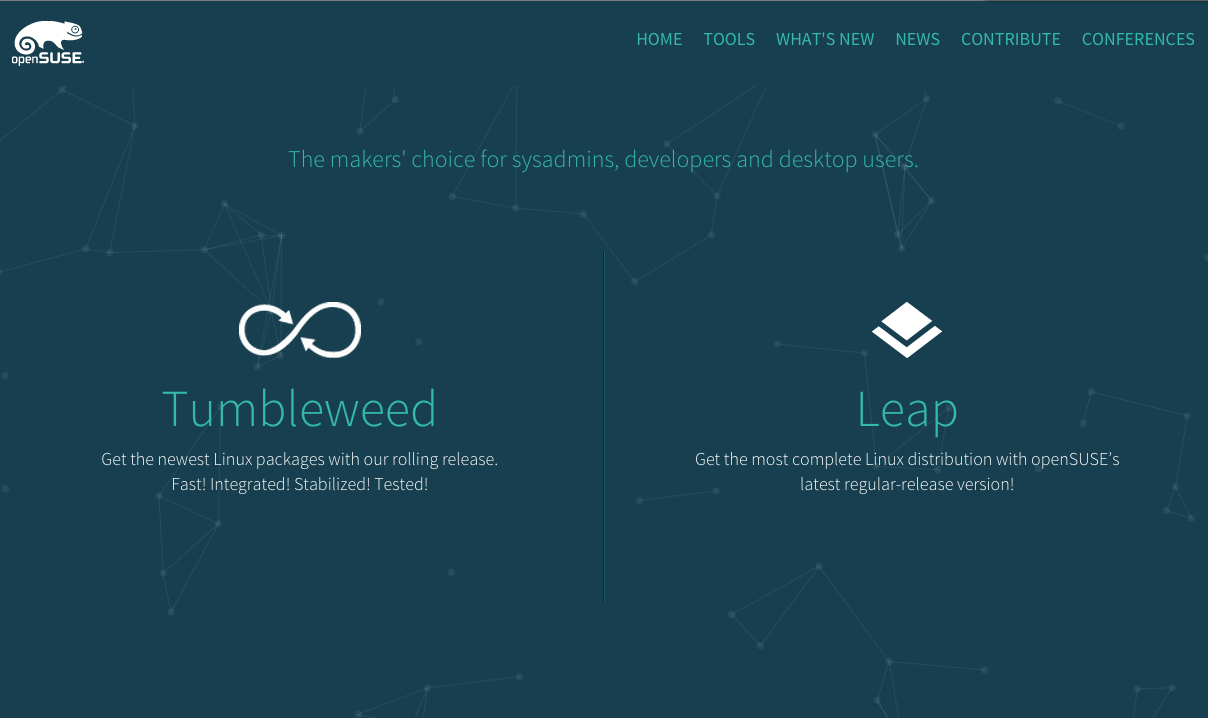
After years working without a defined target audience and rather than focusing on all software, internet and computer users, the openSUSE Board invested time and knowledge understanding the real personas behind our beloved openSUSE. They identified two "different" users: the Tumbleweed user and users wanting a long-term distribution - the Leap user.
Well, the answer is simple: just like the saying goes "The shoemaker's son always goes barefoot" we were leaving our main door to new comers old and rusty. We implemented a new UI highlighting the most important information for newcomers and of course. A community like ours is always contributing and working together to make openSUSE better every single day.
Here we have to take note of a couple of new technologies that were implemented, but, before we go to the technical side, let's talk about the colors:
If you are one of the openSUSE fans, we are sure you have seen the printing material Zvezdana Marjanovic created during her years of contributions to the community as a Graphic Designer. The new color pallete is publicly available at: http://opensuse.github.io/branding-guidelines/
At this point we need to say Thank you! to the Board and Douglas DeMaio for helping to provide the text and direction of the website. How we organized the Information and why
- Tumbleweed vs Leap: The way we see it, Tumbleweed and Leap (regular release) users have the same passion but sightly different approaches with openSUSE. The first one (Tumbleweed) goes for an up-to-date tested, reliable and stable system with new rolling versions of updated applications and software they are developing; while the second one (Leap) goes for a long-term type release that provides unmatched longevity and stability. This made us understand that new users needed to understand these differences in the main section of the landing page, so they can understand the differences between the two. For our regular visitors, the next sections is more relevant.
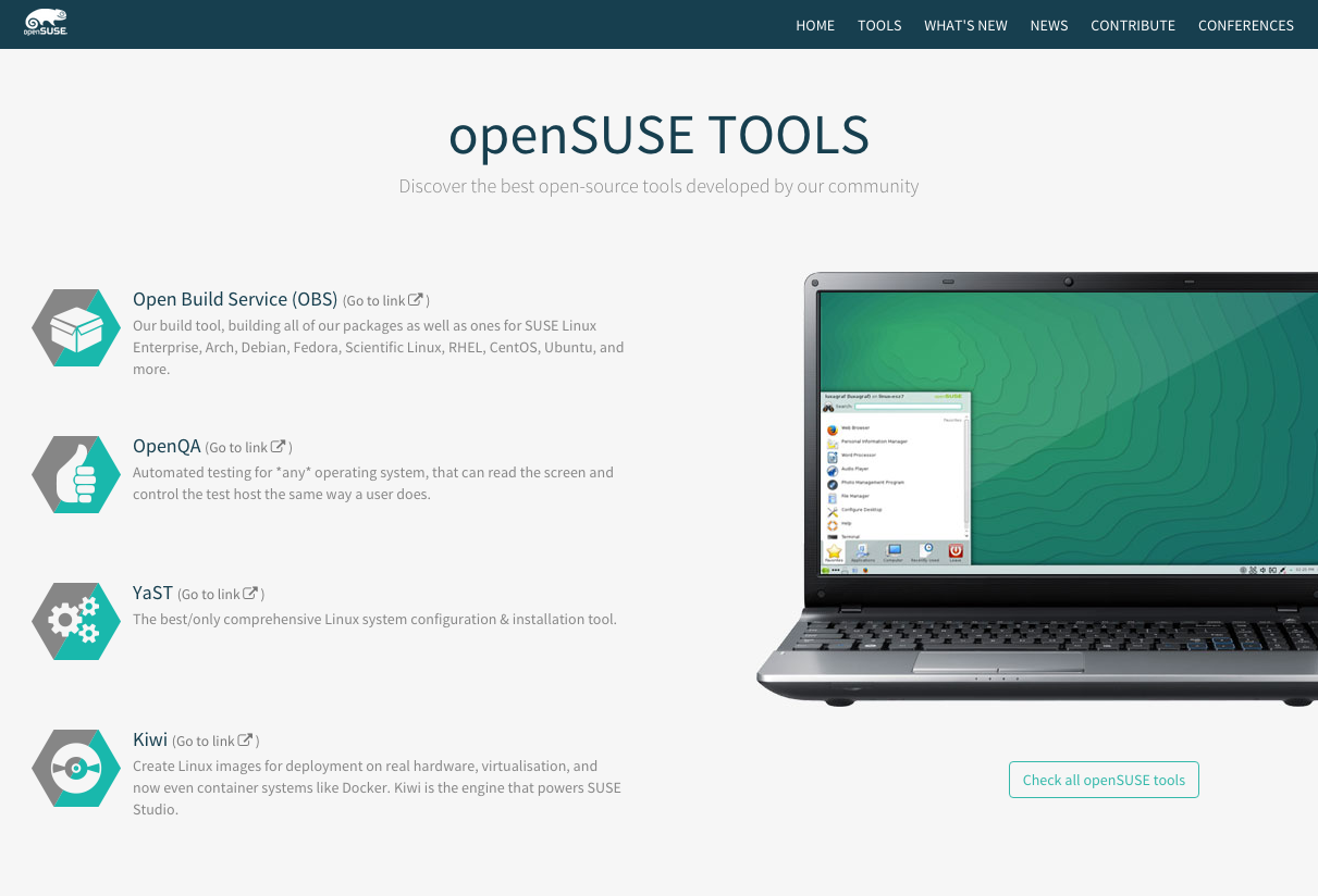
- Tools: With help of the Board, we filtered out four of the most popular openSUSE tools: OBS, OpenQA, YaST and Kiwi. The reason for a second important position in the site is simple: our tools are an important part of the openSUSE Project, the choice maker for many openSUSE users. So we decided to give them a brief explanation (extracted from Richard Brown's blog) and present some screenshots as well as a link to see All openSUSE tools.
-
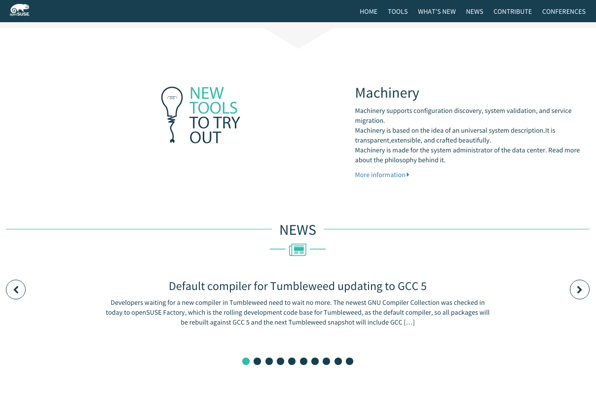
What's new: In the old landing page, unless there were a blog post about it, it was hard to find out new openSUSE tools available for everyone to try. We don't know exactly how regularly openSUSE will be launching new tools, but as soon as there is something new and exciting, this will be the right place to find out more about it. Oh, and to answer the question "why in the 3rd position?" the reason is simple, it is a tool, but a new one which is still grow in popularity, that makes it fair enough to be following the "Tools" section.
-
New: Nothing but a Re-make of the blog's news from the old landing page. Since we have the section already describing something new from openSUSE, we merged the general news from openSUSE.
-
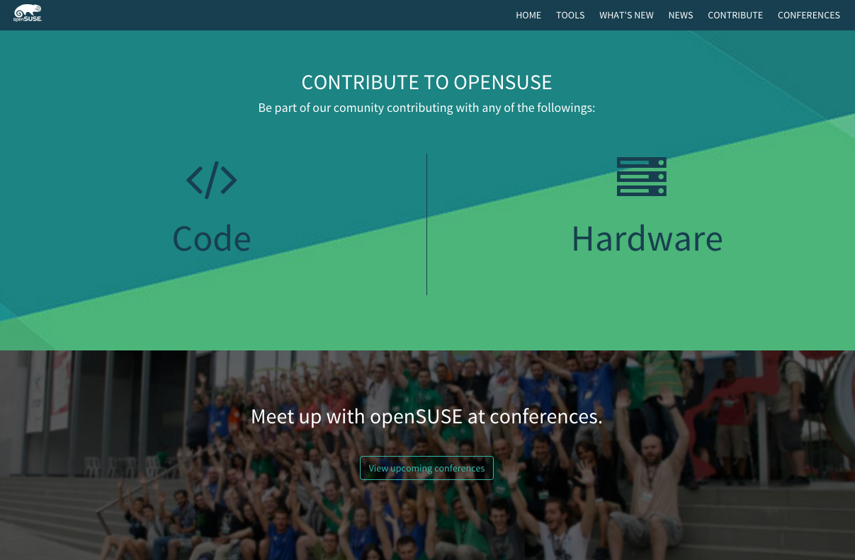
Contribute: After giving information about our main distributions, our most popular tools, our new tools and news around openSUSE, our visitors will feel somewhat excited about our open-source environment and this is the right time to ask and invite them to contribute with us!. So here, we present them the opportunity and the information on How to contribute.
-
Conferences: Last but not least, and if we did create some excitement in our users, we also invite you to come to meet the openSUSE community in action at one of our conferences, summits, mini-summits or events we attend around the world. And why not, try the openSUSE beer :)
This is an static landing page and so, I (cynthia, who is writing this nice explanation for you) decided there is no reason to involve backend in the development. Pure front-end would be enough to take you through the website nice and smoothly on any device you use to browse opensuse.org, providing i18n and reading the blogs content from json.
But, what exactly did you use and why?
-
Twitter Bootstrap: I picked this front-end framework for many reasons: it's the most popular html, css and js framework in today's Internet; it is highly customizable; it is a very friendly with cross-device development; there is well-written documentation for everyone to easily learn bootstrap; it powers up the development speed, and so much more.
-
HTML5: The new landing page includes html5 tags such: < header >, < section >, < article >, < footer >, etc. Is this a risk nowadays? Not from my point of view; few are using browsers non-html5 compatibles, however, for those who still use old-fashion browsers, I made sure the html5 tags are still displaying as block, but of course, if you are using a browser from Mart that I didnt know about and did not test, feel free to open an issue in github and I will do my best to work to fix it.
-
Less: There are sass/scss and less lovers/fans, but I am one of the less' fan. Why? First: I find it more intuitive, Secondly: I find the less documentation to be better written and that makes it easier for most people to learn it, Third and the most important: Less variables are simply overwritten once you place the new variable below in a new line, this, makes it a lot easier to customize bootstrap or any other framework written in less. In Sass/scss, you need to import the variables of bootstrap, then your varibles, the the whole bootstrap set, then your theme and then, once again, your variables to overwrite (for the second time) the bootstrap variables. This, to me, makes absolutely no sense at all. Less works as just as any other code where the new declaration of value of a variable overwrites the previous one and the functions using the variable take always the last value of the variable, the updated one.
-
Jquery: First off, jquery is a dependency of Bootstrap, so even if I didnt like it, I would have needed to use it, but, that isn't my case. I like jquery. It saves time (although it increases the memory consumption) creating interpolations and animations in the website as well as its syntax is much more cleaner than using pure javascript.
** And some open source js libraries **
- jquery-lang: This is the library (created by Irrelon Software Limited and used by many web apps, one of them, easyJet) that allows us to have a simple i81n implemented in the front-end asigning the different languages in simple Json files. More info at: https://github.com/Irrelon/jquery-lang-js
-
OWL carousel: A well written JS library allowes us to easily create a carousel in the News section which also features Touch interactions (for tablets and phones). It has multiple uses and it is one of my favourite carousels for the wide range of ways one can implement this carousel in a website. More info at: http://owlgraphic.com/owlcarousel/
-
WOW: A very popular script in today's websites reveals elements as they appear on the screen as use scrolls. Simple and easy to use. It gives the openSUSE landing page the last touch it needed to have a more modern look and feel. More info at: http://mynameismatthieu.com/WOW/docs.htmlope
-
jquery.easing.1.3: A simple Jquery library that extends the easing effect for the "animate" method which only includes swing and linear. In this case, it was used to give a better effect to the bouncing ball under the Contribute section which you will see if you click on any of the two options.
Thanks to:


