-
Notifications
You must be signed in to change notification settings - Fork 27
tech_gamut volume
I realize I've come this far without too much discussion of technical terms (Yay!). But maybe it's time for some definitions so we can all be on the same page in the following discussions.
Color Model
A generic name for a way of representing and encoding color. Most images we commonly interact with are encoded with an RGB color model. HSV is another color model you may have used, which represents hue, saturation, and value, instead of red green and blue intensities.
Colorspace
A map describing how color can is represented. Attributes:
- Whitepoint - coordinate of the neutral point, or achromatic axis. The color of white.
- Primaries or Gamut - coordinates for the red, green, and blue primaries. The actual color of each tristimulus.
- Transfer function - The shape of the curve used to encode values in the colorspace.
Chromaticity
A coordinate on a 2-dimensional chromaticity diagram. Represents the "hue" and "saturation" of a color, without the luminance of the color. The CIE 1931 system of colorimetry is still commonly used.
Chromaticity Diagram
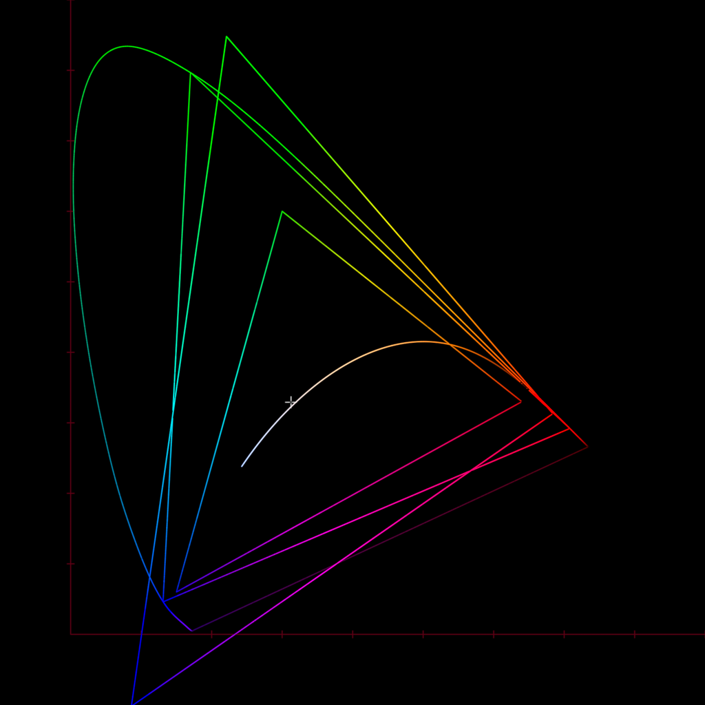
A plot of chromaticities. A common way that colorspaces are represented visually. Above you can see the horseshoe shape of the spectral locus (the outer boundary of the human visual system), and a few different gamuts plotted: Rec.709, Rec.2020, and Arri Wide Gamut. You can also see the Planckian Locus, and the little cross is the D65 whitepoint.
So we talked a bit about scene-referred and display-referred colorspaces. A scene-linear colorspace used by a camera manufacturer might use a linear transfer function (obviously), a custom set of primaries optimized for the camera's sensor, and a D65 whitepoint. This would define a colorspace. There might also be a log encoded version. This would be a slightly modified version of the colorspace with a logarithmic transfer function instead of a linear one.
I find Chromaticity diagrams like the one above to be over-used. So many introductory color science videos start with "Colorspace! Here's a chromaticity diagram". I think starting with this is confusing, and of limited use because it only shows a part of what's going on: the chromaticities. We also care about the intensity values and 3-dimensionality of the pixel data. So we'll also use our familiar little display gamut volume cube plot.
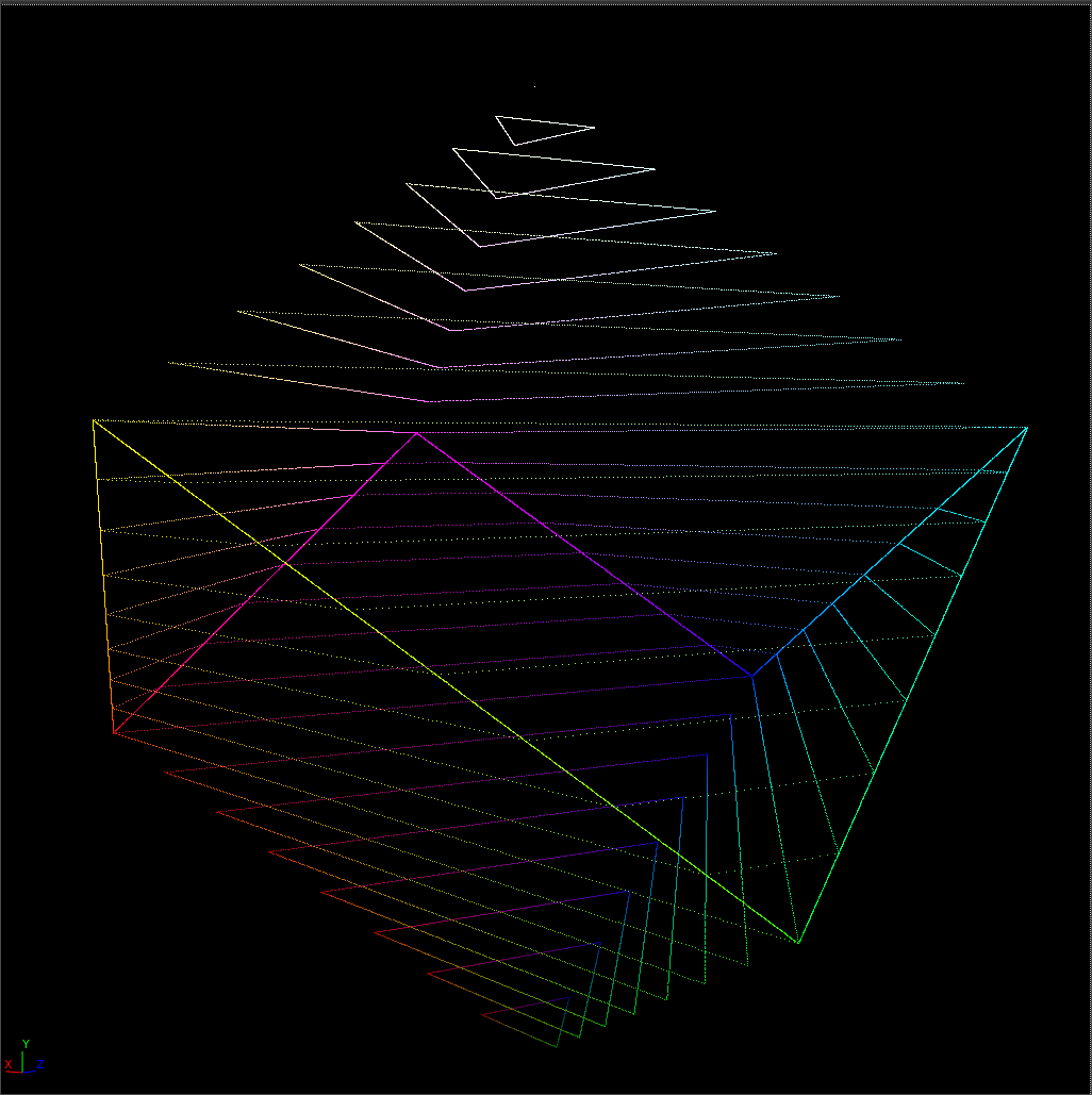
Let's remove the top of the cube so we can get a better view of what is inside.
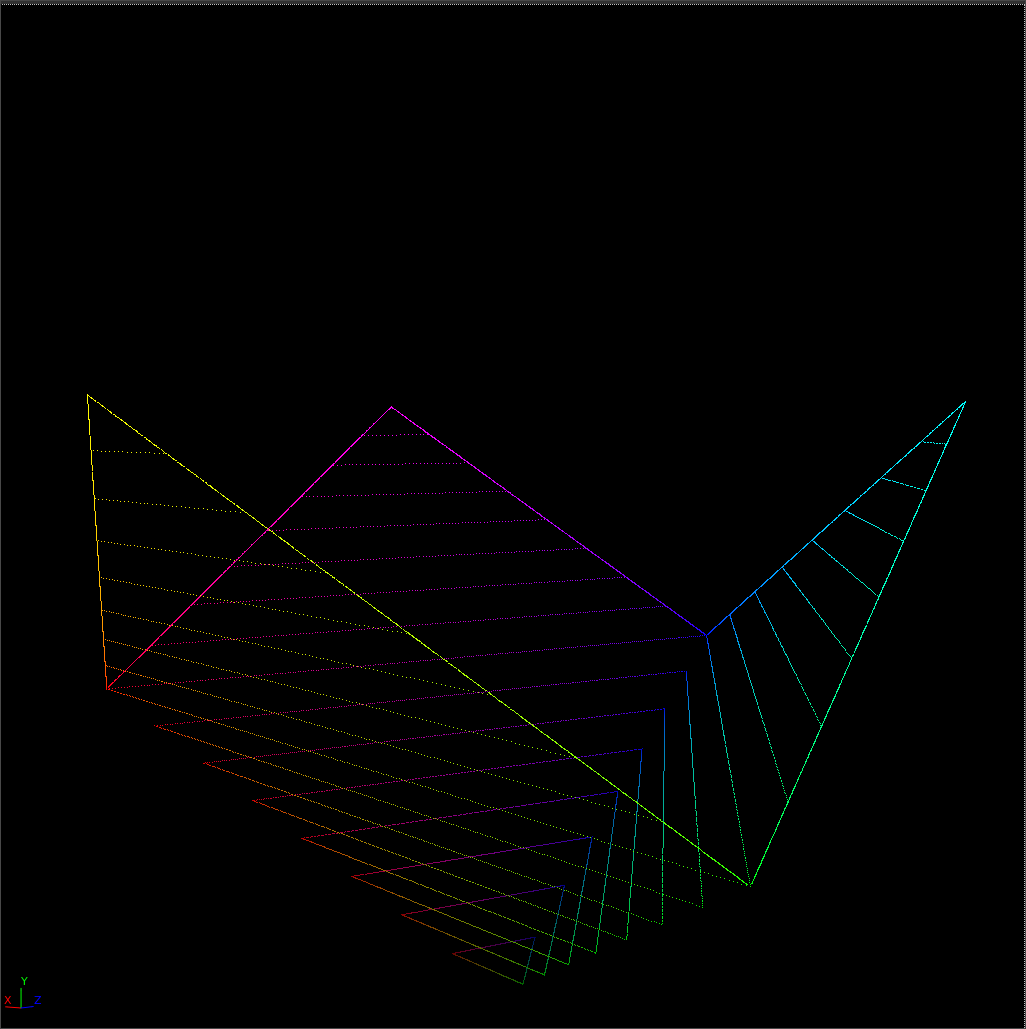
"That's disgusting. What is this, a European beach??"
-- Angry Reader
If we plot a simple gradient of varying intensity from 0 to 1, with equal values in red, green, and blue, we can see what is called the Achromatic Axis. This is the vertical line in the colorspace where the tristimulus values are equal to each other: r=g=b.
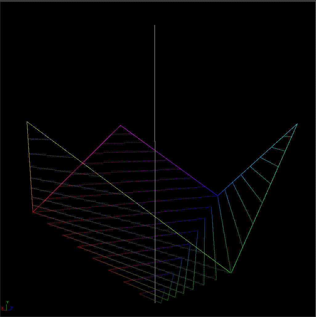
In the above topless cube, we can see primary colors (red, green, blue) form the lower corners, and the secondary colors (cyan, magenta, yellow) form the upper corners. If we add color into our gradient in these six directions, maybe something like this:

We get a line going from the tip of the achromatic axis (the whitepoint) down to the individual corners mentioned above.
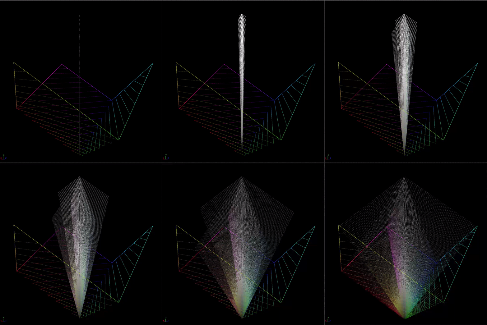
At the achromatic axis, there is no color information. At any of the faces of the cube, this is the gamut boundary.
If we draw color samples out from the achromatic axis and rotate around the cube, it might look like this.
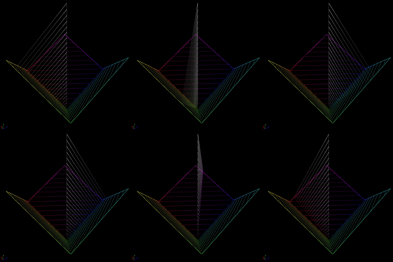
So here we have the three main "dimensions" of color.
- The direction the sample is facing relative to the achromatic axis creates the dominant wavelength. When varying the angle, we perceive different hues of color.
- The distance of the sample from the achromatic axis creates the purity of the color. When varied this changes the apparent saturation or chroma (colorfullness) which we perceive.
- The height of the sample creates the luminance of the color. When varying the luminance this changes the apparent brightness that we perceive.
"What are all of these complicated shit terms! Just call it what it is!!"
-- Angry Reader
At this point you may have noticed that I'm trying very hard to make a distinction between the color stimulus and the sensation which that stimulus provokes in our visual system. It is very common to loosely use the terms "brightness, saturation, and hue", for either thing or both, and it is problematic for many reasons, which will hopefully become apparent later. I'm not immune to this and will probably mess up and use the terms loosely as well. Hopefully the context will make which thing I'm talking about clear, if I do not catch it.
Nuke Script
Here's the nuke script used to generate these plots if you want to play.
You probably remember before I said it was not possible for values to exist outside of the display-referred gamut volume. In a display-referred colorspace this is true. In a scene-referred colorspace, this is false. One of the color components will just go negative.
Let's see what this looks like. Here we'll use a 4-up plot of a single RGB tristimulus value:
- Top-left: RGB color being plotted
- Top-right: RGB values visualized as a graph between 0 and 1.
- Bottom-left: CIE 1931 xy chromaticity plot zoomed in to an RGB gamut triangle.
- Bottom-right: 3D RGB cube bottom, with achromatic axis.
Nuke Script
Nuke script used to generate this plot

As we can see, in a scene-referred colorspace where negative values are allowed, a color that is too saturated for the RGB gamut will happily sail right past the gamut boundary.
A 3x3 Matrix can create these kinds of values. If you convert from a "bigger" gamut to a "smaller" gamut, you can create these types of out of gamut negative values, if there is a chromaticity in the source gamut which can not be represented in the destination gamut. For example if you convert from Arri Wide Gamut to ACEScg, it is quite common for this to occur.
What if we turn this into a display-referred colorspace by clamping our range from 0-1? (This is effectively what happens when you save your image out into an integer data format).
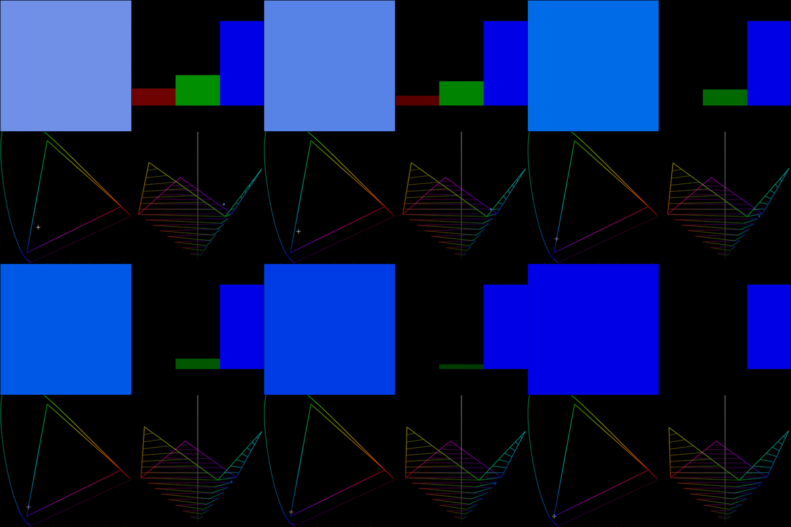
Now an interesting thing happens. When the color hits the gamut boundary, it slides right along the edge until it gets to whatever the max of red green or blue is, in this case blue. Then it stops. This happens because negative values aren't possible.
The same thing happens at the top end of the cube. Let's take a look at a "rat piss yellow" example. Say we start with a moderately saturated orange tristimulus color, and we boost the exposure so that some of the RGB components go above 1.
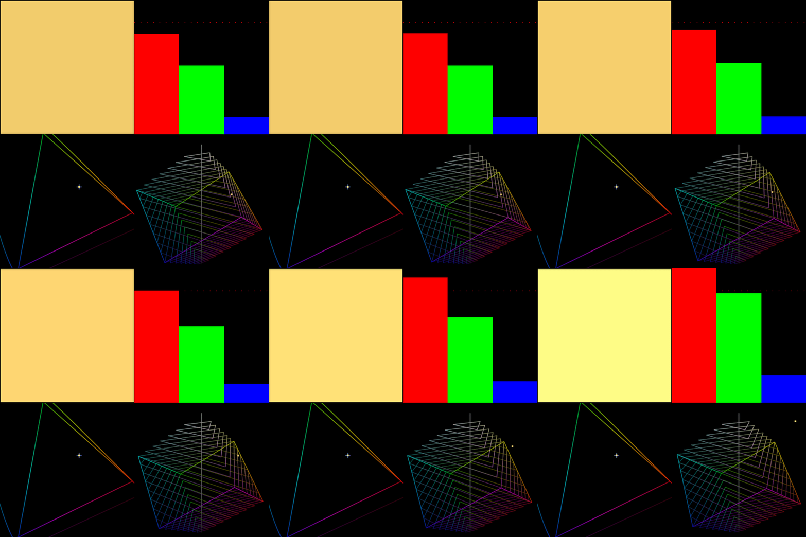
Here I'm changing the RGB visualizer on top right. The dotted red line is 1.0. We can see that in a scene-linear colorspace, an orange color will happilly sail right out of the display-referred gamut cube. The intensity values keep increasing, and there is no change to the chromaticity coordinate.
But what happens when we clamp the output into a 0-1 range?
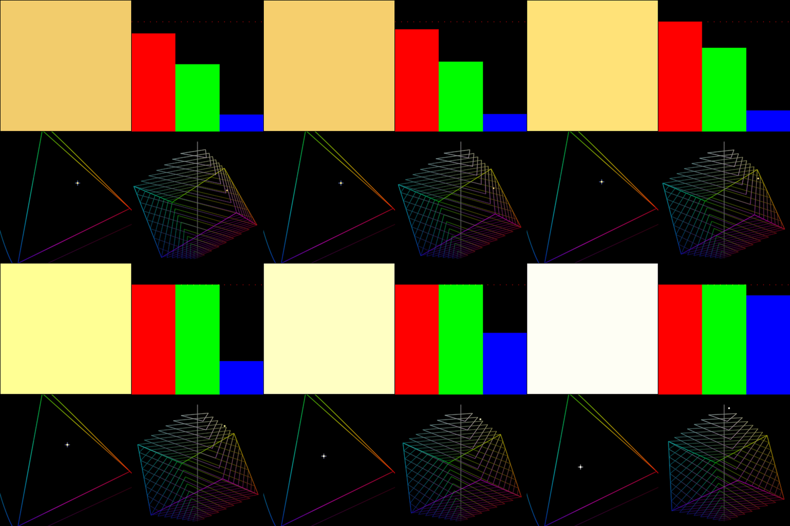
Surprise! The sample smashes right into the top of the display gamut boundary, and as each of the color channels clips, the color heads towards peak achromatic. But it gets there along the "ridge" of the secondary color, in this case yellow. This is the source of all "rat piss yellow" in images we consume every day.
"I would prefer that you stop being so crass. Can't we call that a nice golden sunshine yellow instead?"
--Angry Reader
No.
Next...
