Cartography for gridded data
Gridded statistics are most of the time shown using color shade variations. This page lists possible more advanced cartographic technics for more advanced visualisation, especially for multivariate visualisation.
Grid cells can be shown with different colors, size or both combined (when showing 2 variables):


To show the spatial relation between two or several variables, several symbols can also be shown next to each other:
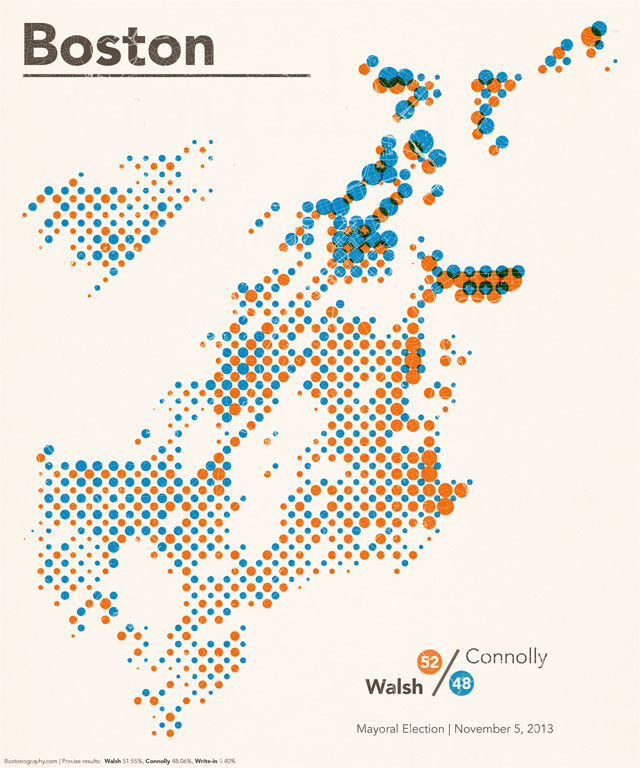
See http://bostonography.com/2013/halftones-walsh-connolly/
NB: Different cell shapes (square, circle, diamond, rectangle, triangle, etc.) could also be used to differentiate them.
For statistical variables showing a breakdown of a total (example: population by gender, age group, GDP per NACE code, etc.) such composition can be shown by decomposing the grid cell symbol into different pieces and showing them differently.

Possible implementations:
- Pie charts
- Donuts
- Flags
- Stripped circles
(TODO insert image)
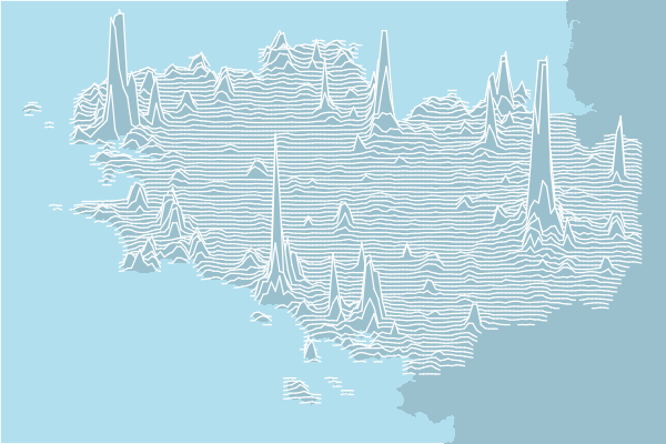
Grid cells are displayed by raw, as a line.


See https://observablehq.com/@d3/spike-map?collection=@observablehq/county-maps
See https://github.com/riatelab/linemap

See https://github.com/ColCarroll/ridge_map and https://towardsdatascience.com/beautiful-ridge-maps-with-python-640906a30e10
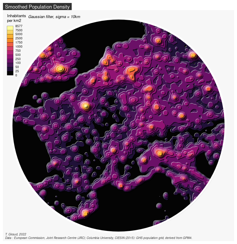
Kernel smoothing allows showing major trends in a spatial distribution. Such map is sometimes called "heat map". The smoothed values can be shown using hypsometric tints or contour lines, or both combined.

See https://www.insee.fr/en/statistiques/fichier/3635545/imet131-l-chapitre-8.pdf and https://www.researchgate.net/publication/262605807_Kernel_density_estimation_and_hotspot_mapping_Examining_the_influence_of_interpolation_method_grid_cell_size_and_bandwidth_on_crime_forecasting

See https://www.inwt-statistics.com/read-blog/the-representation-of-corona-incidence-figures-in-space-and-time.html and https://www.inwt-statistics.com/read-blog/covid-19_heat-map_of-local_7-day_incidences_over_time.html and https://cran.r-project.org/web/packages/Kernelheaping/index.html
See https://observablehq.com/@uwdata/fast-kde
Contour maps

See https://observablehq.com/collection/@d3/d3-contour
See https://github.com/riatelab/tanaka
See another possibility: http://www.dwtkns.com/density/
Orientation can be used to show changes. The orientation of the symbol (typically a segment) can be proportional to a variation. The width and color of the segment can be used to show other variables.

See https://www.washingtonpost.com/graphics/politics/2016-election/election-results-from-coast-to-coast/
Animations: Screen symbols may be animated, the amplitude and direction of the movement being linked to a change of a variable.


NB: These visualisations "hide" part of the data, which are located behind peeks.