-
Notifications
You must be signed in to change notification settings - Fork 2
Layers behavior
Filling layers with colors
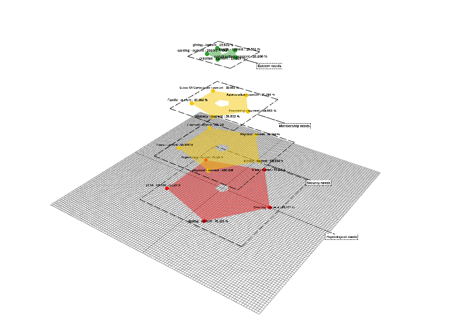
Layer Status Calculation: The layer color is determined based on the percentage of its current values compared to the total maximum values.
Given metric_status = (current_value - min_value) * 100 / (max_value - min_value) , the of layer status formula is:
Layer_Status = ∑ metric_i_status / number_of_layer_metrics
Color Ranges:
- If the layer status value is in the range [0 ; 33%[, it is colored green.
- If the layer status value is in the range [33% ; 66%[, it is colored yellow.
- If the layer status value is in the range [66% ; 100%], it is colored red.
This approach provides a visual indication of the status of each layer based on its calculated percentage, with different colors representing different levels of status or health.
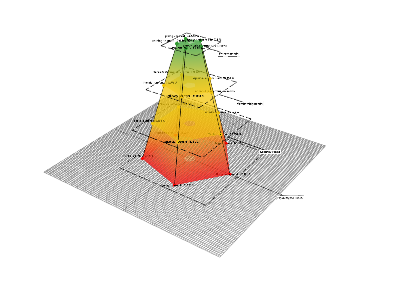
 Colouring the sides
Each side colour is a gradient colour that goes from the previous lower layer colour to the next upper layer colour.
Each metric is associated with four values: current, minimum, medium, and maximum. The representation of these metrics involves displaying a sphere for each. The color of each sphere is determined by the percentage of the current value relative to the maximum value.
The formula is: metric_status = (current_value - min_value) * 100 / (max_value - min_value)
The criteria for assigning colors are as follows:
- If the percentage falls within the range [0 ; 33%[, the sphere is rendered in green.
- If the percentage falls within the range [33% ; 66%[, the sphere is rendered in yellow.
- If the percentage falls within the range [66% ; 100%], the sphere is rendered in red.
This visual representation provides an immediate and visual indication of the status of each metric based on color distinctions.
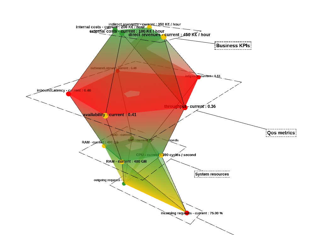
Layers can now support various types of behavior that can change metric units in the overall display of Palindrome.js:
- Percent: The values are represented as a percentage.
- Normalized: The values are normalized (L2 norm).
- Absolute: The values remain as they are without any relative scaling or percentages.
This configuration can be defined inside the data structure, like this:
"requests": {
    "metrics": {
        /* metrics ... */
    },
    "layer": {
        "requests-layer": {
            "label": "Requests",
            "layerMetricsUnits": "percent"
        }
    }
}
Alternatively, it can be configured via Storybook configuration. Notably, the layerMetricsUnits field in the data structure is optional for a single explicit layer. You can also change the layerMetricsUnits Storybook control to affect all layers collectively.

In the figure below, all layers are configured to have absolute values. Nevertheless, the second and the last layers are displayed in normalized and percentage units, respectively, as they are explicitly configured for these two layers in the data structure.
 {width="616" height="457"}
Additional options have been incorporated into the data structure, enabling the explicit configuration of layer colors. It is now possible to specifically configure the static, minimum (min), medium (med), and maximum (max) colors, as well as the colors for the corresponding spheres (static, min, med, max) within that particular layer.
"Layer1": {
    "metrics": {
       // metrics...
    },
    "layer": {
        "Layer1-layer": {
            // other options...
            "mainColorStatic": "#319b31",

            "layerColorLow": "#ffffff",
            "layerColorMed": "#f3c60a",
            "layerColorHigh": "#000000",

            "sphereColorLow": "#ffffff",
            "sphereColorMed": "#f3c60a",
            "sphereColorHigh": "#000000",
        },
    },
},
In this example, the overall static color is set to green; however, in the data structure, for the very last layer, the static color has been specified as white.
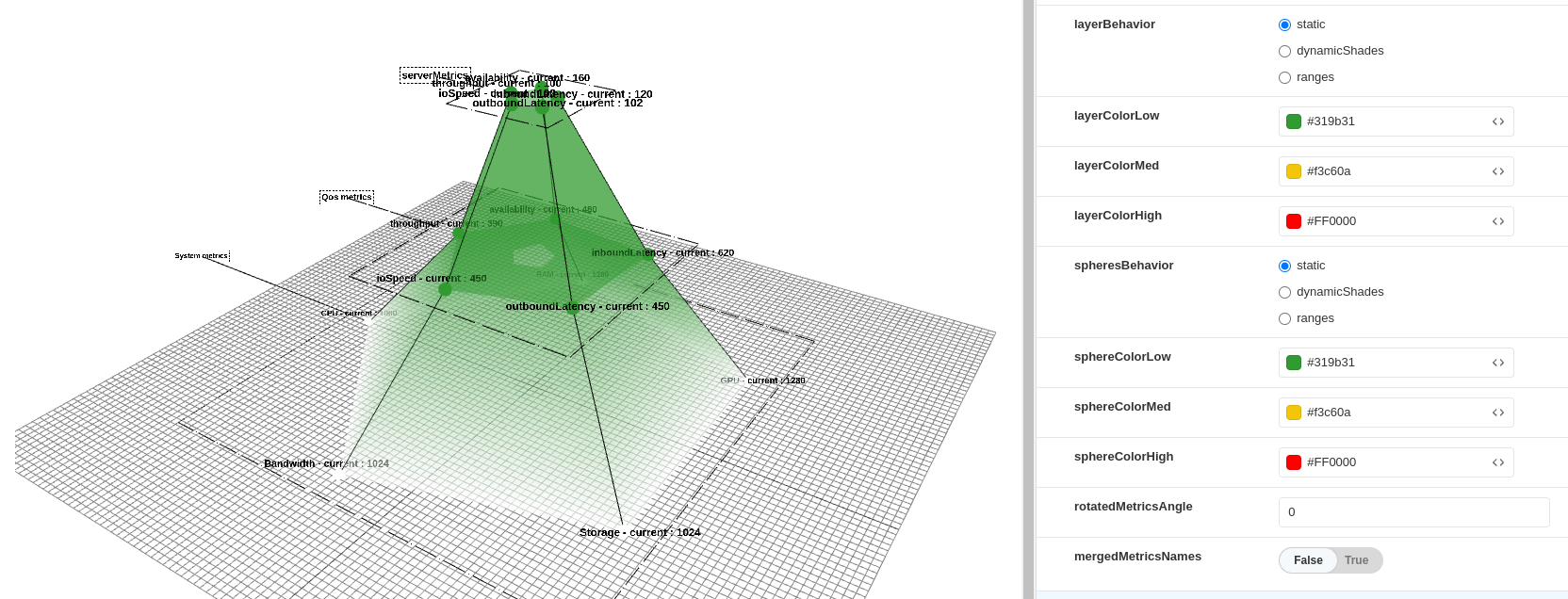
Despite the low, med, high color controls being configured in Storybook as (green, yellow, and red, respectively), the data structure overrides this configuration with (white, blue, and black). It is also possible to go further by configuring individual layer minimum, medium, and maximum colors.
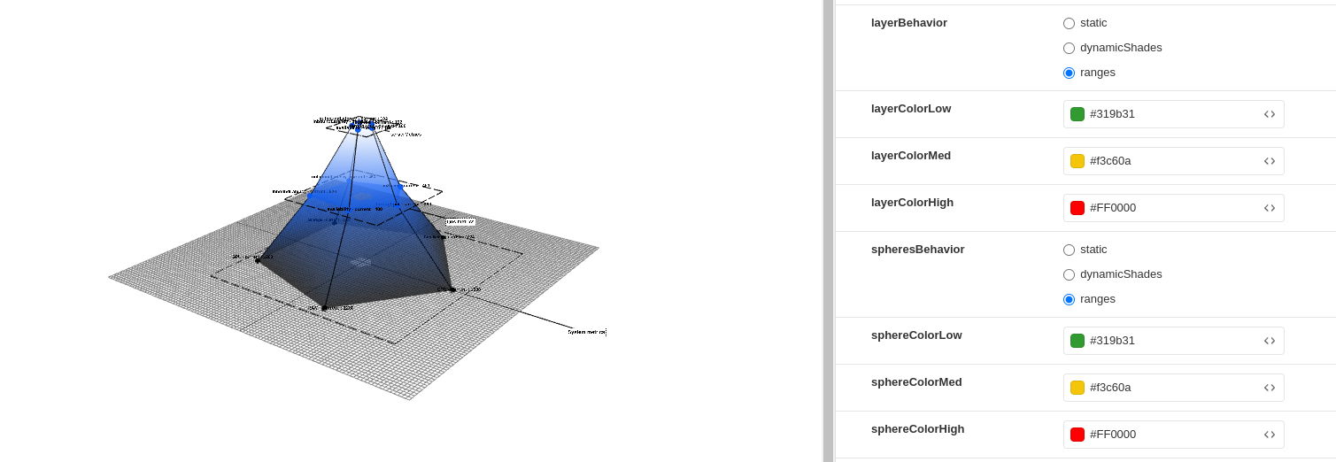
Notes:
- Data structure color configuration is optional.
- Data structure color configuration takes precedence over Storybook configuration.
New features have been incorporated, comprising three distinct controls:
- labelToFrameLinkType: This control offers the choice between two options: "static" or "dynamic".
- labelToFrameLinkLength: This control enables users to set the length of the links.
- equalizeFrameLinks: When this control is enabled (set to "true"), all links will have uniform length. The length of these links can be adjusted by modifying the value of labelToFrameLinkLength.
When labelToFrameLinkType is set to "dynamic":
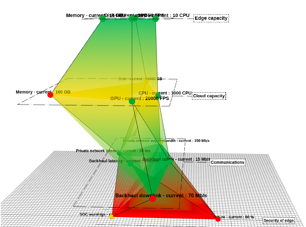 {width="648" height="481"}
If the value of labelToFrameLinkType is set to "static", it indicates that all links will terminate at identical positions. This characteristic can be adjusted by modifying the labelToFrameLinkLength parameter.
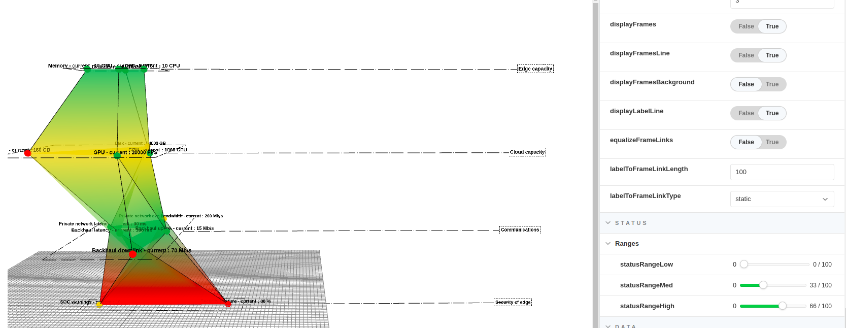 {width="645" height="249"}
Alternatively, when labelToFrameLinkType is set to "static" and equalizeFrameLinks is set to "true", signifying uniform link lengths, the length of these links can be adjusted using labelToFrameLinkLength:
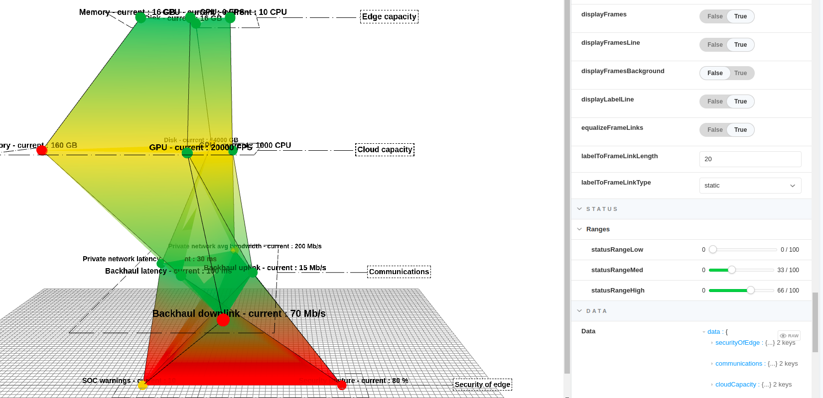 {width="641" height="310"}
A new feature has been implemented at the layer level, introducing an option called "layerSize" to specify the size of the layer in percent. This enhancement ensures that regardless of adjustments made to all current values, whether they are set to maximum or minimum, the rendered output will adhere to the specified layer size.
"layer": {
  "MembershipNeeds-layer": {
    "label": "Membership needs",
    "layerSize": 50,
  }
}