MDX Components
We use MDX to provide dynamic content in otherwise static pages. This lets us use React components in all articles, while still keeping it easy to maintain. On this page, you'll find all available MDX components and how to use them.
The components are defined in MyCryptoHQ/knowledge-base. You can find the source code for all components here.
An accordion consists of two or more different blocks of content, that are expandable and collapsable. This can be useful for the user to quickly navigate to the content they are looking for.
There are two components for the accordion: Accordion and AccordionItem. Each content block should be wrapped in an AccordionItem, and all AccordionItems should be wrapped in one Accordion.
AccordionItem has one prop:
-
title(string) (required) - the title to show for the content block.
<Accordion>
<AccordionItem title="First block">

This is the first content block.

</AccordionItem>
<AccordionItem title="Second block">

This is the second content block.

</AccordionItem>
<AccordionItem title="Thid block">

This is the third content block.

</AccordionItem>
</Accordion>
Note: there should be a blank line between the tag and the content, so the content will be parsed as markdown.
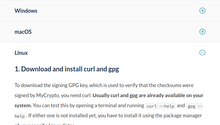
A full example can be found in staying-safe/verifying-authenticity-of-desktop-app.md.
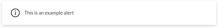
An alert is a block of content that stands out from the rest, grabbing attention from users. It can be used for important messages, that the user should read.
Alert has one prop:
-
type(string) - either "info" or "warning", defaults to "info"
<Alert>

This is an example informative alert.

</Alert>

<Alert type="warning">

This is an example warning alert.

</Alert>
Note: there should be a blank line between the tag and the content, so the content will be parsed as markdown.
A clearfix can be used in conjunction with floating images, to properly position content around images.
Clearfix does not have any props.
<Clearfix />TODO.