This feature details document provides more details and explanations of some features in FlexColorScheme V4. The reason for keeping it in a separate file from the package readme is that the package readme is already very long, and keeping it separate document allows it to be updated and complemented more freely without updating the package due to complementary documentation updates.
This document is ported from the version 3 readme documentation. It still applies to version 4, it will be updated and more feature documentation added when this document is merged and included in a separate documentation site.
- Visual Density
- Optional FlexThemeModeSwitch
- Computed Dark Theme
- Convenient AppBar Theming
- The TabBar Style
- True Black
- Themed System Navigation Bar in Android
Examples 3,4 and 5 in this package use comfortable adaptive platform visual
density via FlexColorScheme.comfortablePlatformDensity, instead of the
default counter application's VisualDensity.adaptivePlatformDensity.
This is an alternative visual density design that on desktop applications
results in the Flutter comfortable visual density being used, instead of
compact. On devices, they both result in the default large standard
visual density that is suitable for small touch devices.
This helper function was added to provide an easy option for using a bit larger UI elements on desktop and web apps, while keeping the correct size for devices.
If the desktop and web versions of the app is used on computers with touch
screens, the comfortable density provides a nice balance. It still looks
compact enough to be desktop like, while providing a bit more touch friendly
space, without looking like an overblown small device UI on a desktop.
FlexColorScheme can also use the VisualDensity.adaptivePlatformDensity value.
If you prefer it, just replace the line with it. If you do not specify any
visual density, the Flutter default density standard is used on
all platforms. This creates widgets with a lot of white space around and
inside them. It may not be what you want on web/desktop applications, but is
the correct choice for small touch devices. The visual density feature in
Flutter was created to address this difference in design requirement.
The Flutter SDK built-in function VisualDensity.adaptivePlatformDensity
was added to adapt the density according to used platform. The
FlexColorScheme.comfortablePlatformDensity does the same, but with a bit
more white space on desktops. Use the one you like and works best for
your use case.
One feature on the HomePage of examples 1 to 4 is the FlexThemeModeSwitch.
It is the UI Widget used for the 3-way theme mode switch used in these
examples to change the active theme mode.
Using the switch is very simple, give it the currently selected and active theme
mode, the current FlexSchemeData scheme, so it can color its buttons correctly.
Then use the onThemeModeChanged callback for changes to its mode, and change
the themeMode property in the MaterialApp accordingly, to actually change
the used theme mode.
FlexThemeModeSwitch(
  themeMode: themeMode,
  onThemeModeChanged: onThemeModeChanged,
  flexSchemeData: flexSchemeData,
),
Using the FlexThemeModeSwitch 3-way theme mode switch is optional and not
required to use FlexColorScheme based themes. It is just a custom theme mode
switch design and was included as a bonus feature in the
FlexColorScheme package. It was added based on a request after it
had been observed in the wild in the Flexfold demo app.
In the Flexfold demo app the switch was originally a fairly fixed design.
This FlexThemeModeSwitch has many properties that allow you to customize
it extensively. You can find its API
reference here and its companion, the
FlexThemeModeOptionButton API reference here.
With the API you can customize the look of the FlexThemeModeSwitch,
here are some examples:
The FlexThemeModeOptionButton is typically used by the FlexThemeModeSwitch,
but it can also be used as a part of other theme related indicator widgets.
Like for example the scrolling horizontal list used in example 5, where it is
used as a theme indicator and selector in a horizontally scrolling list.
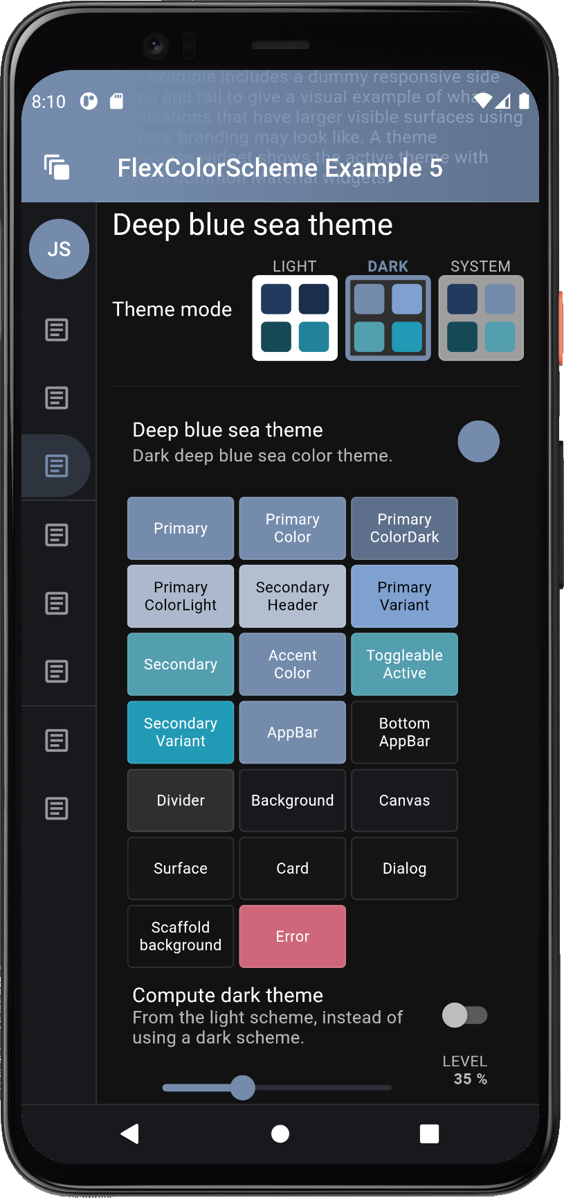
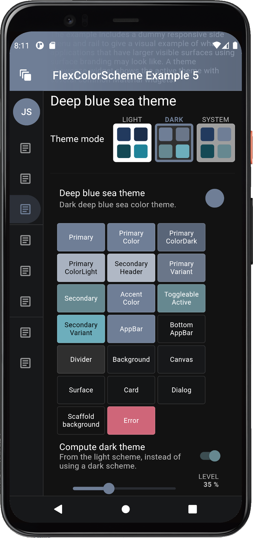
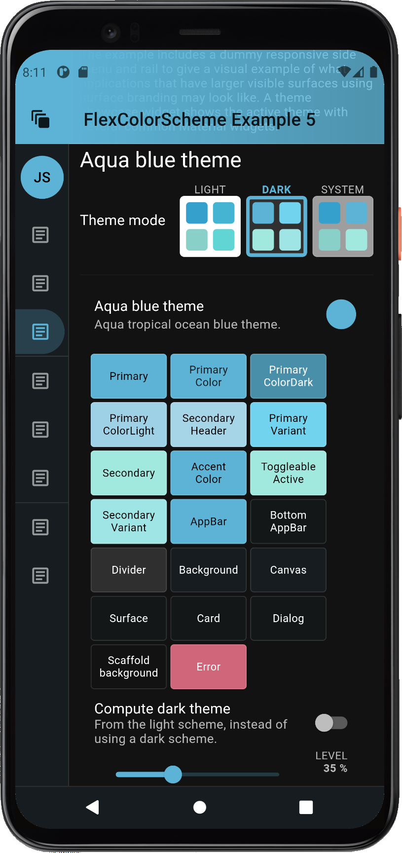
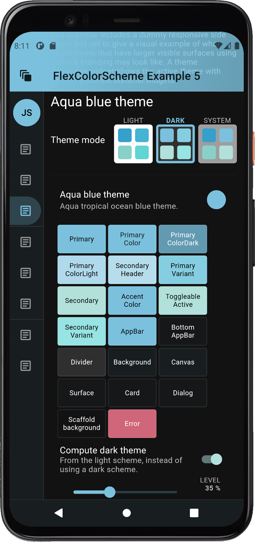
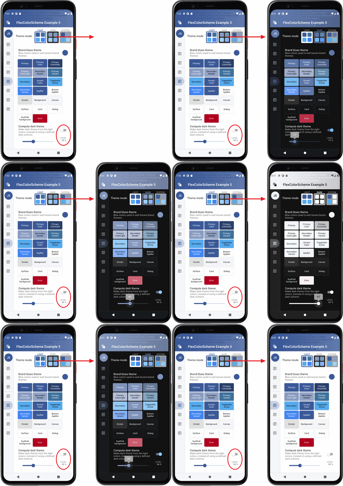
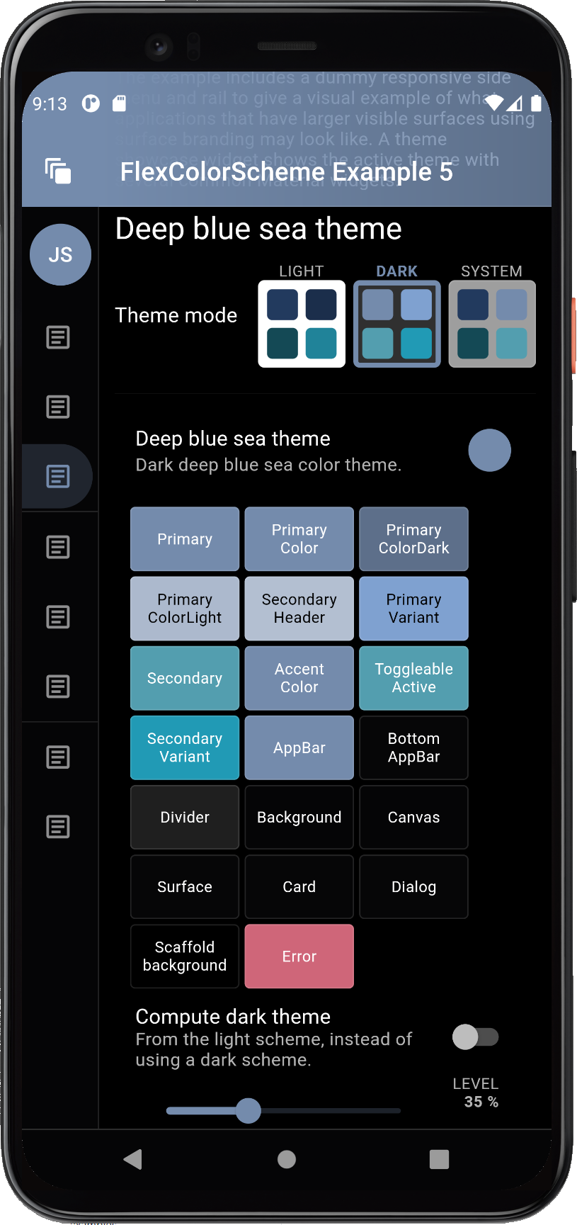
Example 5 allows us to toggle the dark mode, from using its hand tuned predefined dark scheme colors, to the dark scheme colors computed from the light scheme colors. Let's use it to compare some examples.
When using the deep blue sea scheme, the computed dark theme colors ones are a bit more dull and muted in this example, the computed dark scheme is on the right.
With some other color schemes, like the Aqua blue one, there is only a minor difference, the computed dark scheme is on the right.
The result of the toDark method varies depending on how saturated the used
light scheme colors are. It is possible to tune the calculated dark scheme by
modifying the whiteBlend property it uses to blend in white to make the
dark scheme. The default whiteBlend is 35%, this is normally a suitable
value. For more saturated light scheme colors try 40%, which is also used in
the Material 2 design guide to convert the default red error color for light
mode, to dark mode. For light scheme color with low saturation, a white
blend of 20...30% often produces nice results.
With the included level slider in the example 5 we can interactively change
the whiteBlend level for the computed dark mode scheme colors. Let's select
a color scheme, say the Brand blues one, then go dark.
By default, the built-in predefined hand-picked matching dark scheme colors for the dark theme mode are used. Turn on the "Compute dark theme" mode, the result is pretty close to the predefined one for this dark scheme with the default level of 35%. Then adjust the white level blend to tune how saturated the computed dark scheme colors are compared to their light scheme master. At 0% they are the same as the light scheme, at 100%, well then they are white, not so useful. A range of 10...50% can produce excellent results. What is best depends on how saturated your starting light scheme colors are, and of course what kind of matching dark theme look you like and want.
If you use the even darker dark-mode, true black, you may want to have a different saturation for your dark scheme colors compared to standard dark-mode surface. You could easily implement that adjustment with this feature.
This screen recording compares the computed toDark theme result, to the
built-in hand-picked one. It does this by toggling the mode a few times, so
you can compare the different results. It also uses the level slider
to adjust the toDark theme result. A sharp eye might notice that this
recording does not use the defaultError error color modifier, the changing
dark error color does not look so nice when tuning the computed scheme colors.
The bundled example 5 and live web version of it uses the modifier.
Let's study what FlexColorScheme can do with the AppBarTheme and how you
can match it to your surface blending if you like.
You can easily toggle both dark and light mode AppBars to use differently
themed backgrounds. By default, Material design uses AppBars with
ColorScheme.primary color for light theme mode, and the dark background
color in dark theme mode. Without using a separately defined sub AppBarTheme,
FlexColorScheme AppBars can use different themed backgrounds based on
an enum value.
The themed AppBar background can use scheme primary color, default Material
plain white/dark background color, primary branded surface, primary branded
background color, or a custom AppBar color.
The FlexColorScheme scheme's appBarColor is a separate scheme color that
does not exist in Flutter's standard ColorScheme, so it does not have to be
any of the colors available in a ColorScheme.
The predefined schemes use the color defined in a ColorScheme
scheme's secondaryVariant color, as their value for the custom appBarColor.
When you make your own schemes you can do the same or use a totally
none ColorScheme related color as the AppBar's custom color option. This
color then becomes one of the FlexColorScheme's easy selectable AppBar theme
color options, via the appBarStyle property and the FlexAppBarStyle enum,
in this case via the custom choice.
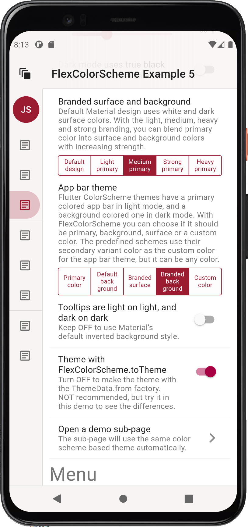
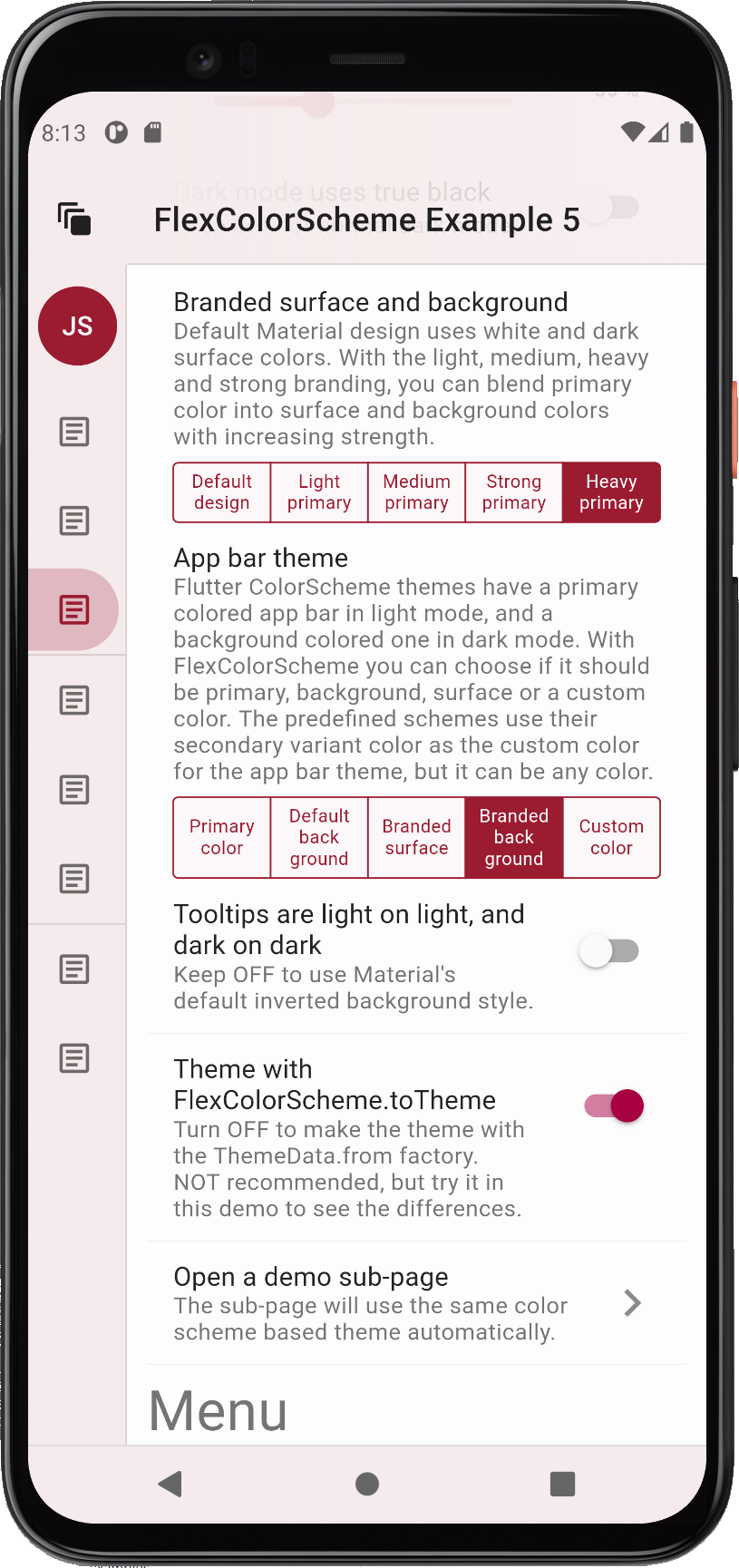
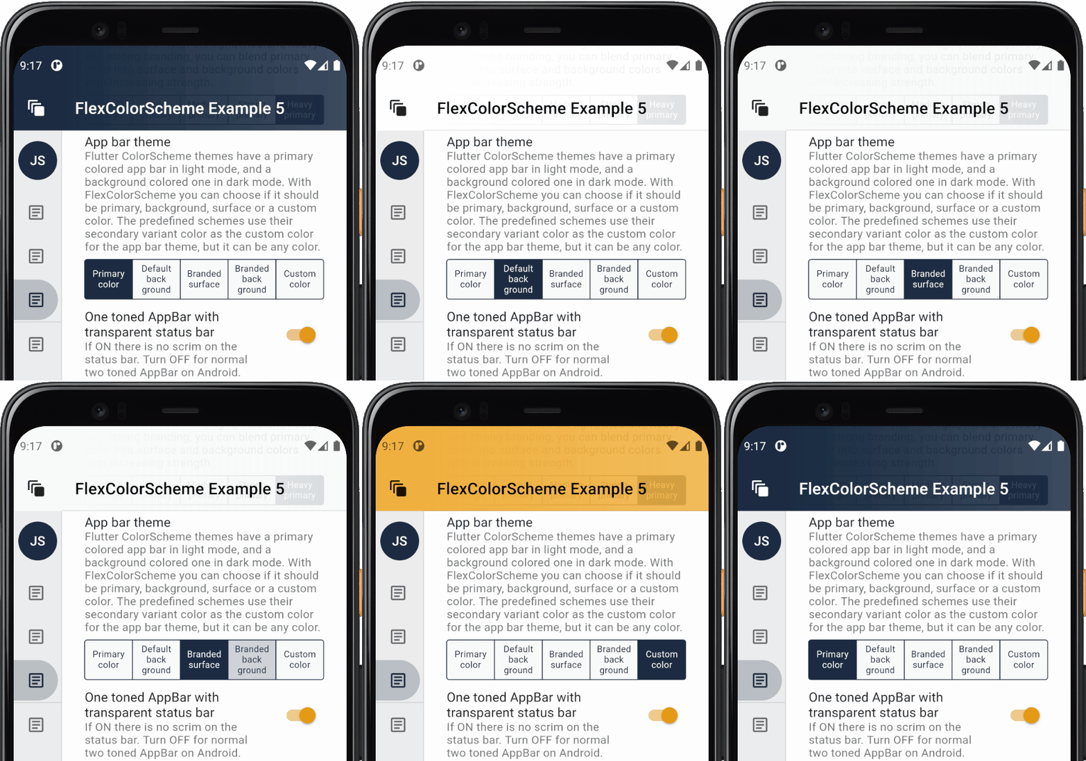
Below you can see some different branding strengths with a background primary color branded app bar theme used. This example compares medium versus heavy branding. The medium choice is usually well-balanced, but light can be subtle and nice too. If you want to make a bold statement theme, go with heavy. Please note that the visual impact of the branding also depends on how saturated the primary color is.
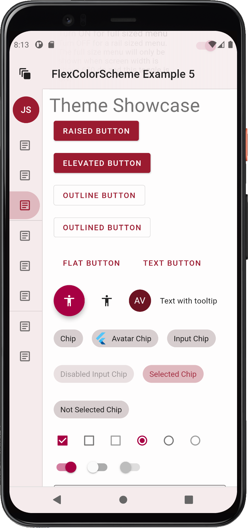
Here are few more images of the heavy primary color branded version, when looking at some widgets as well.
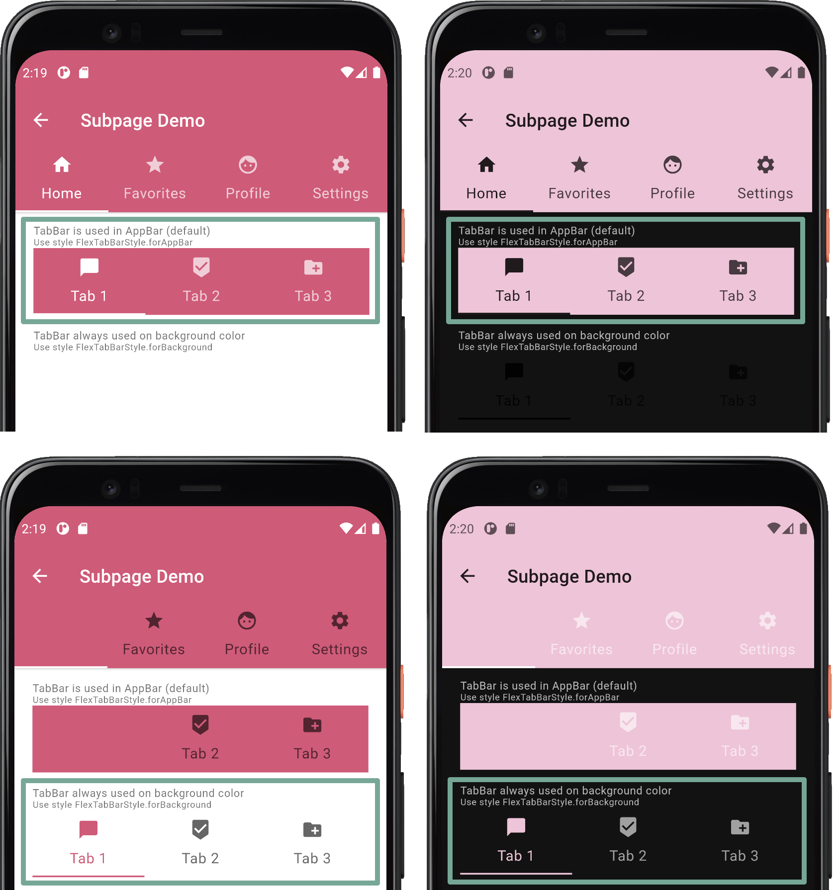
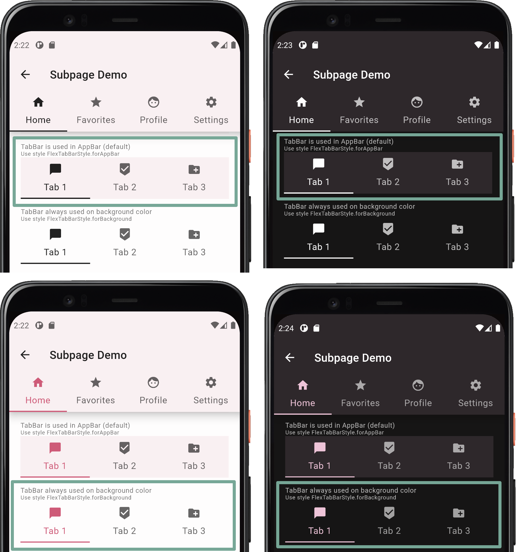
The tabBarStyle property can be used to toggle the theme the TabBar
receives. By default, a theme that is designed to make it fit in an AppBar,
regardless of which style you have selected for it, is used. This is the
FlexTabBarStyle.forAppBar style. The typical usage of a TabBar is to have
it in an AppBar, and the default style works for this use case.
Alternatively you can choose a style that makes a TabBarTheme that fits well
on background colors. Use this option if you intend to use the TabBar in a
Scaffold body, in Dialogs, Drawers or other surface and
background colored Material. If you do so, you do not have re-theme it, or
style it separately for this purpose.
If you intend to use TabBar widgets in both AppBars and on surface and
backgrounds, you will have to choose the style that most often fits your
use case. Then theme it separately for the other use case. You would have to do
the same with Flutter standard themes and TabBarTheme as well when not
using FlexColorScheme, but the first theme your get without effort.
Which tabBarStyle style and resulting TabBarTheme actually works best,
depends on the background color. Here we see TabBars used on surfaces and in
an AppBar, when the AppBar is using primary color. As can be seen, the tab bar
theme that goes well in an app bar in such a case, does not fit on the surfaces
at all, and wise versa.
If you plan to use only surface or background (also the branded ones) colored AppBars, you can see that both tab bar styles, and their resulting themes work for both situations. The difference is minor, and it is a matter of opinion which one is preferable. Both style options can be used if you restrict your app bar color to background colors, or their primary branded variants. In such a use case you can get away with using just one of the built-in style options, even if you use tab bars in both app bars and on other surfaces.
Dark-mode is nice, but with FlexColorScheme you can go even darker, go true black with the flick of a
switch. When using the true black option for dark-mode, surface, background and scaffold background are set to
fully black. This can save power on OLED screens as the pixels are turned off, but it can also cause scrolling artefact
issues when pixels turn fully on and off rapidly as you scroll. You can read about this and see an example of it in
the Material design guide
as well. (Scroll back up one heading from the link to get to the mention of it.)
If you use branded surfaces with true black mode enabled, you will notice that the branding has a lower impact, only at strong and heavy levels does it have a visible effect. This is by design to keep most surfaces totally or very close to black when true black is combined with surface branding. If you really want complete black for all surfaces and backgrounds, then avoid combining true black mode with branded surfaces. On the other hand it still makes a darker theme than normal dark theme, which can look nice. It may also eliminate the scrolling issue, since all background colored pixels are not fully off in the strong and heavy branded true black modes.
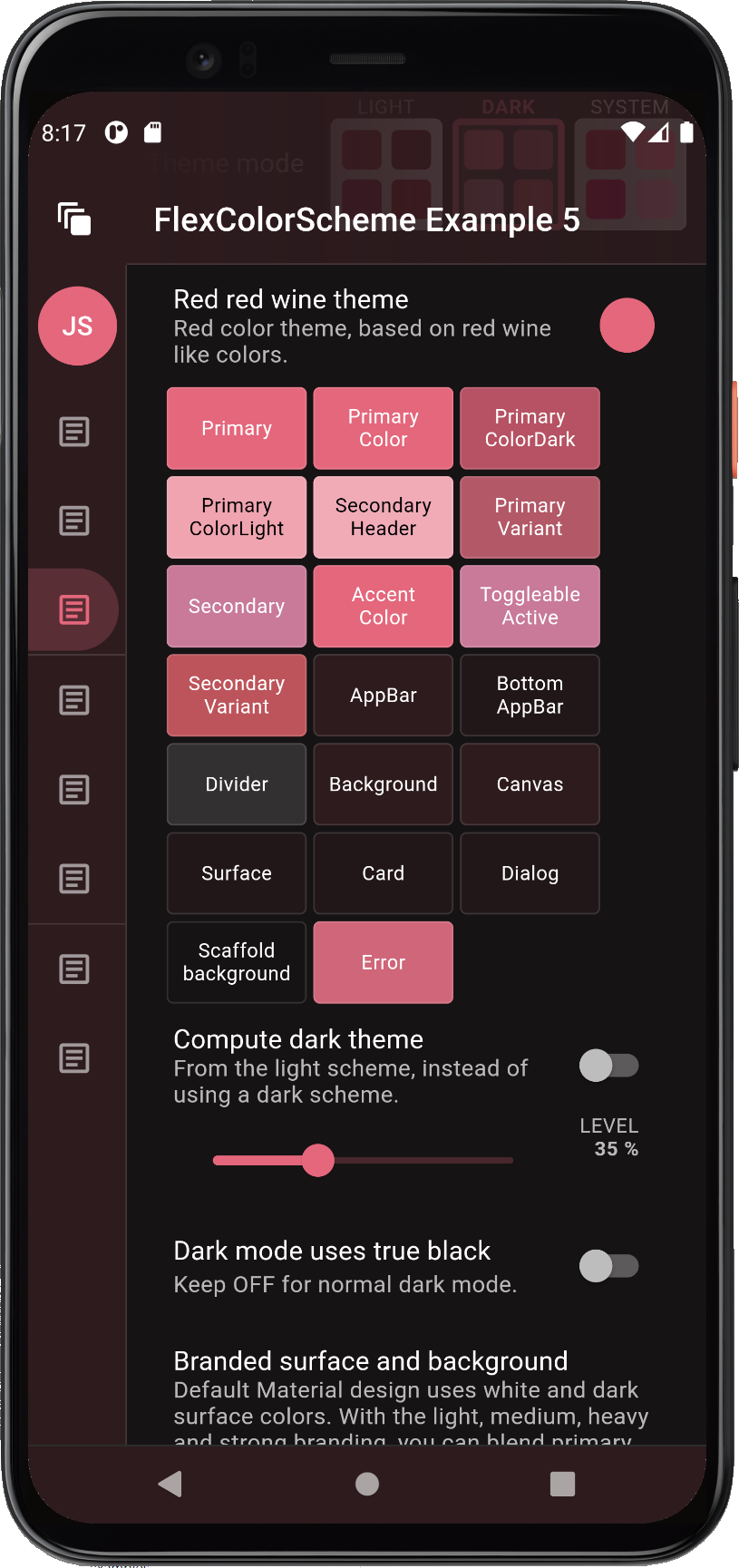
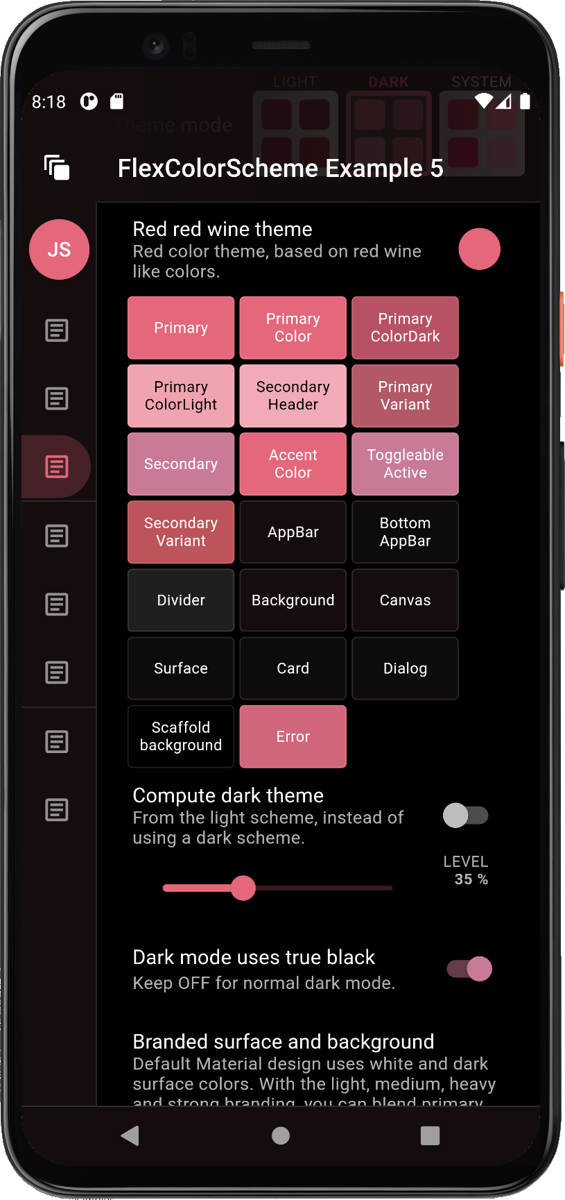
Here is an example of a branded dark theme with true black OFF (default and standard) and true black ON, when using heavy branding with the Red red wine color scheme.
Here is another difference example with the Deep blue sea scheme, when using medium strength surface branding, and a primary colored app bar in dark-mode.
The HomePage's build method for this example starts by wrapping the entire page content in an AnnotatedRegion
with a SystemUiOverlayStyle value that we get from the static helper
FlexColorScheme.themedSystemNavigationBar(context, ...).
Using this we can get a system navigation bar, typically on older Android phones that still uses one, that follows the active theme's background color and theme mode. The system navigation bar will get updated as you select new themes, different background color branding style and strength, and toggle dark and light theme mode. Many Flutter applications neglect or forget to include this feature in their themes.
   return AnnotatedRegion<SystemUiOverlayStyle>(
     value: FlexColorScheme.themedSystemNavigationBar(
       context,
       systemNavBarStyle: systemNavBarStyle,
       useDivider: useSysNavDivider,
     ),
     child: ....
   );
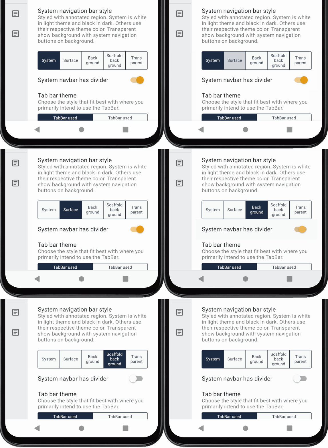
Above the systemNavBarStyle is a local FlexSystemNavBarStyle state variable tied to the same UI choice in the demo
home screen and useSysNavDivider is local bool state variable. Together with the option to remove the status bar
scrim, you can have easy complete control of both the AppBar's status bar, and the system navigation bar look,
like shown below:
The top status bar scrim toggle, system navigation bar divider and style only have an impact on Android builds, they do not have any functionality on the live Web example.
NOTE:
The static helperFlexColorScheme.themedSystemNavigationBar(context, ...)is designed to provide a convenience wrapper for aSystemUiOverlayStylethat works for screens that use and adhere to current theme mode colors. If your application use screens that do not follow the current theme, then just useSystemUiOverlayStyledirectly in the annotated region for such screens to define their desired style. You can also make your own convenience wrapper function or even just a const value for it if you need to use a fixed style and design frequently.The system navigation bar icons do not seem to change color correctly until API30 (Android 11). On earlier API levels you may sometimes end up with light themed system navigation bar icons, even if you requested dark ones from the Android system. This has been observed at least with Pixel 4XL emulator on API29 (Android 10).
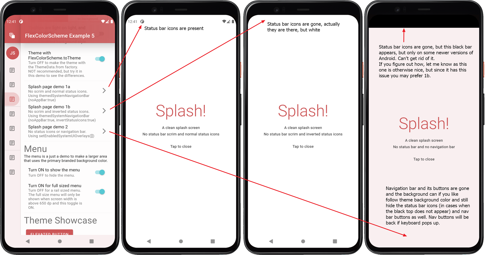
You can also use the FlexColorScheme.themedSystemNavigationBar to hide the top status icons if you are not
using an app bar at all. This can be useful on a splash or onboarding page. Example 5 contains three different
examples, each with their own limitations, read more in the example 5 source code comments on how it
can be used, here what they look like. The last Example SplashPage 2, would be the ideal version, and it
works well on some versions of Android, but seems to fail on newer ones, so you may prefer 1b instead.
Version 4 added full support for transparent system navigation bar for Android
SDK >= 29 (Android 10). The support is added via the
opacity
property in FlexColorScheme.themedSystemNavigationBar.
Use and support for the opacity value on the system navigation bar is supported starting from Flutter 2.5. The PR 28616 will once it lands in stable also result in more predictable and consistent behavior, and limit its functionality to SDK >= 29.
If you build example 5 on an Android device you can try and see the partially and even fully transparent Android system navigation bar in action, by using its interactive "Navigation Bar Settings" panel.


