Skip to content
New issue

Have a question about this project? Sign up for a free GitHub account to open an issue and contact its maintainers and the community.

By clicking “Sign up for GitHub”, you agree to our terms of service and privacy statement. We’ll occasionally send you account related emails.

Already on GitHub? Sign in to your account

Add a contour plot? #265

Open
nvaytet opened this issue Sep 26, 2023 · 3 comments
Open

Add a contour plot? #265

nvaytet opened this issue Sep 26, 2023 · 3 comments
Labels
enhancement New feature or request

Comments

@nvaytet
Copy link
Member

nvaytet commented Sep 26, 2023

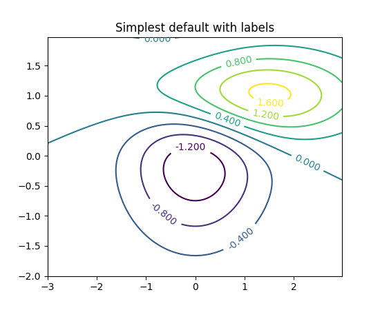
Would look like:
img

We could support both filled and non-filled contours with a kwarg?
filled

Note: I am unsure how masks would be handled in such a plot, as unlike with an image, you cannot just make a small area of pixels with a different colormap.
Passing a numpy masked array to matplotlib's contourf is handled but often yields ugly results with 'torn' boundaries around masks.
Maybe we could just raise if the input data contains masks?

@nvaytet nvaytet added the enhancement New feature or request label Sep 26, 2023
@YooSunYoung
Copy link
Member

YooSunYoung commented Nov 29, 2023

So I got an brief idea:
Contour plot is basically a 2d plot with inter/extrapolation.
like: https://contourpy.readthedocs.io/en/v1.2.0/user_guide/calculate/z_interp.html#z-interp
With matplotlib you can choose a proper one among 4 pre-defined algorithms.
One of the common reasons why the contour plots look ugly is because of a wrong interpolation function.
We can probably just accept an interpolation function as a argument and compute the interpolation first, and make z-dimension discrete, before visualization to have more data points for contour drawing to avoid that.

And by doing this, we can handle the masked region more easily I guess...?
I don't know how exactly handle them though...

For visualization, we can still probably use matplotlib.contour
or we can use 2d plot or line plots if we can easily compute enough data points to make it look smooth.

@nvaytet
Copy link
Member Author

nvaytet commented Nov 29, 2023

One of the common reasons why the contour plots look ugly is because of a wrong interpolation function.

In which cases do you find contour plots are ugly?

We can probably just accept an interpolation function as a argument and compute the interpolation first, and make z-dimension discrete, before visualization to have more data points for contour drawing to avoid that.

Why do we need to do all the work manually? My plan was to let the rendering library do all the work.
Do you have a special case where contour plots did not render well?

@YooSunYoung
Copy link
Member

In which cases do you find contour plots are ugly?

When adding a label on a certain level, it messes up the contour figures for some reason.
So I had to manually add a text on the top of the figure.

Why do we need to do all the work manually? My plan was to let the rendering library do all the work.
Do you have a special case where contour plots did not render well?

Only when there are not enough data points in the contour plot.
Rendering library doesn't only do the rendering, it also does the inter/extrapolation itself underneath, and that makes the plot looks weird... I'll collect some bad examples...

Sign up for free to join this conversation on GitHub. Already have an account? Sign in to comment
Labels
enhancement New feature or request
Projects
None yet
Development

No branches or pull requests

2 participants