Toolbar design #5
Comments
|
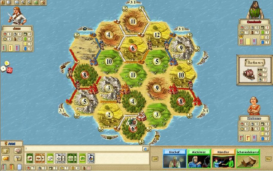
@fry- ~ To me this looks a bit too tight, and not having enough air... Though it shouldn't take too much screen space either 😄 If you have played Catan on a computer (official version), you can see that the "toolbar" is always visible and with fixed size (they don't have camera scrolling, though). Note that other players take a good amount of space, not only one or two buttons... |
|
@bojidar-bg well, first of all this Catan version's board takes very little space. our spaceversion has a much bigger board.
since this info is rarely important, I would hide it in a pop-up window. also it can take alot of space when popping out, for example bottom half of the screen (if you need alot of info + fancy profile images there). |
What do you think about this design for the in-game toolbar? This is of course just some concept and not more then a scratch. I don't mean to discuss colors or placement of specific elements at this step, but rather if we should go with this idea of implementing it to allow more space for the board-view.
The idea is to make pop-out windows when clicking on specific areas of this toolbar. for example clicking on the resources or power-ups will bring up an info screen of their costs or your number-tags (from planets) assigned to your resources. Clicking on the "players" would bring up some overview of your opponents (their number of cards on hand, their current points,...).
What do you think? please make your own concepts and upload them for discussion if you have specific ideas :)
The text was updated successfully, but these errors were encountered: